Delta Waterfall Charts
Delta Waterfall Charts Comparing Between Members
Delta Waterfall Charts between members are a powerful tool for visualizing data, particularly useful for comparing the differences between two specific values. This type of chart is slightly different from measure delta waterfall charts, which compare two different measures as start and end values. Measure delta waterfall charts will be explained in the next section, as they require a different setup, but fundamentally, both types serve the same purpose of highlighting deviations.
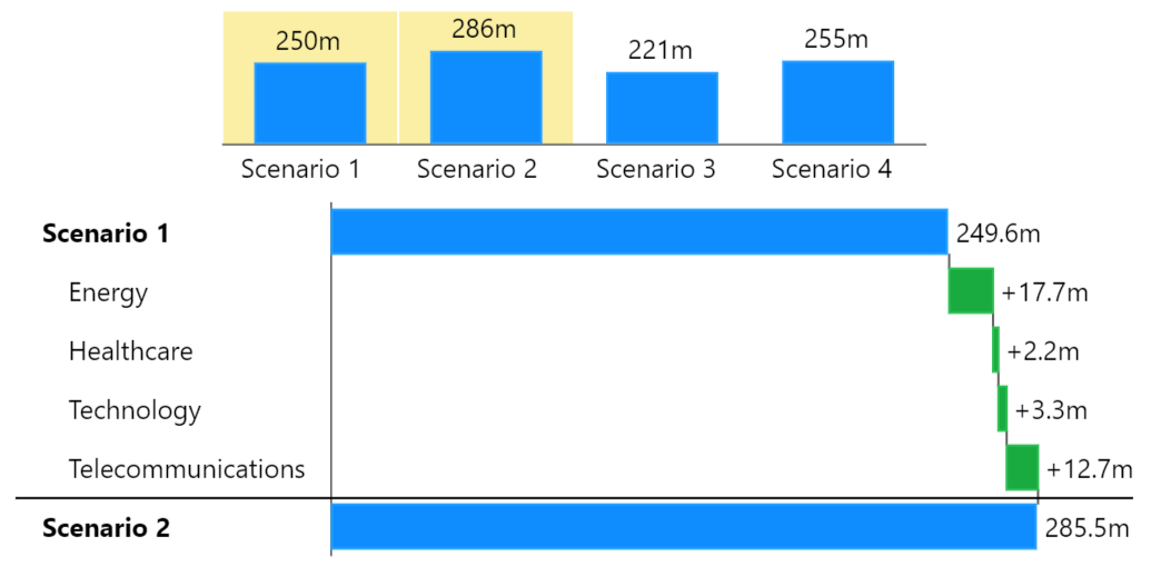
In a delta waterfall chart between members, you start with an initial value and end with a final value, and the chart displays how each intermediate element contributes to the change between these two values. For example, if you are comparing the performance of two years, the initial value would be the starting point of the first year, and the final value would be the ending point of the second year. The waterfall elements in between show how each month within those years differs from the other.
Each bar in the delta waterfall chart represents the difference between corresponding elements of the start and end values. These differences are depicted with color-coded bars: green bars indicate an increase compared to the initial value, while red bars indicate a decrease. This visual representation allows for a quick and intuitive understanding of which periods or components contributed to the overall change.
For instance, if comparing monthly sales between two years, the delta waterfall chart would start with the total sales of the previous year and end with the total sales of the current year. Each bar in between would show the difference in sales for each month, making it easy to identify which months saw growth and which saw declines.
Visual Representation
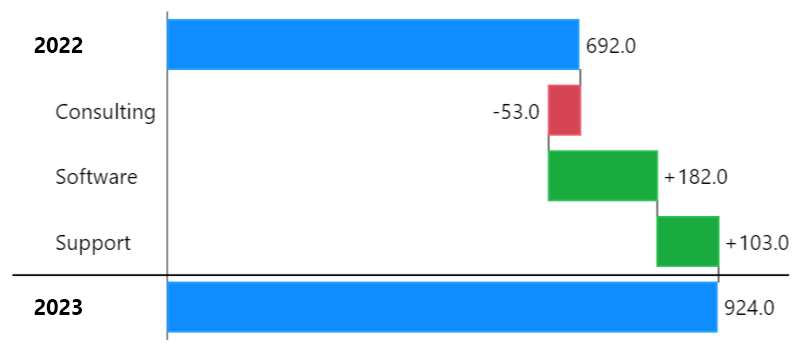
Below is an example illustrating a delta waterfall chart comparing two years. The chart starts with the total revenue of Year 2021 and ends with the total revenue of Year 2022. The bars in between represent the monthly differences:
As shown in the example, each bar is color-coded to reflect the increase or decrease in revenue per month. Green bars indicate months where revenue increased compared to the same month in the previous year, while red bars indicate months where revenue decreased.
Creating Delta Waterfall Charts
There are two options for creating a delta waterfall chart in our visual: using the default configuration or enforcing the delta waterfall scheme through the menu.
Option 1: Default Configuration with "Auto" Scheme
By sticking to the default configuration, where the scheme is set to "auto," you can create delta waterfall charts in a very flexible manner. Here's how it works:
Initial Setup: Start with the default "auto" scheme.
Drill Down: Perform a drill down into your data to explore the details.
Select Elements: In the drill down history, select another element by clicking on it while holding the control key (Ctrl). The visual will automatically construct a delta waterfall chart between the two selected elements.
This method is highly flexible, allowing you to select and compare arbitrary elements with each other. You can even select multiple elements for comparison, making it easy to visualize differences between various parts of your data.
Option 2: Enforcing the Delta Waterfall Scheme
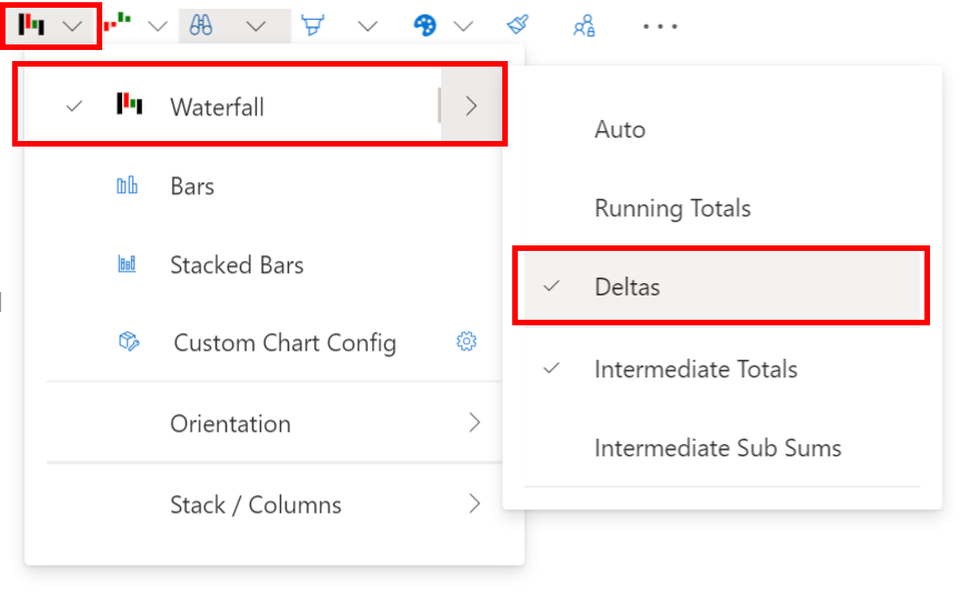
Alternatively, you can enforce the delta waterfall scheme through the menu:
Select Delta Waterfall Scheme: In the menu, choose the Delta Waterfall Scheme to force this option.
Consistent Delta Waterfall: This scheme ensures that the visual always displays a delta waterfall chart.
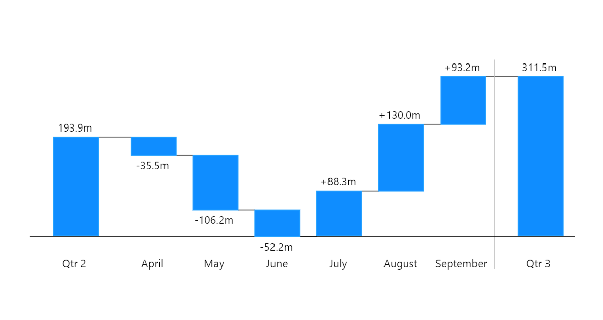
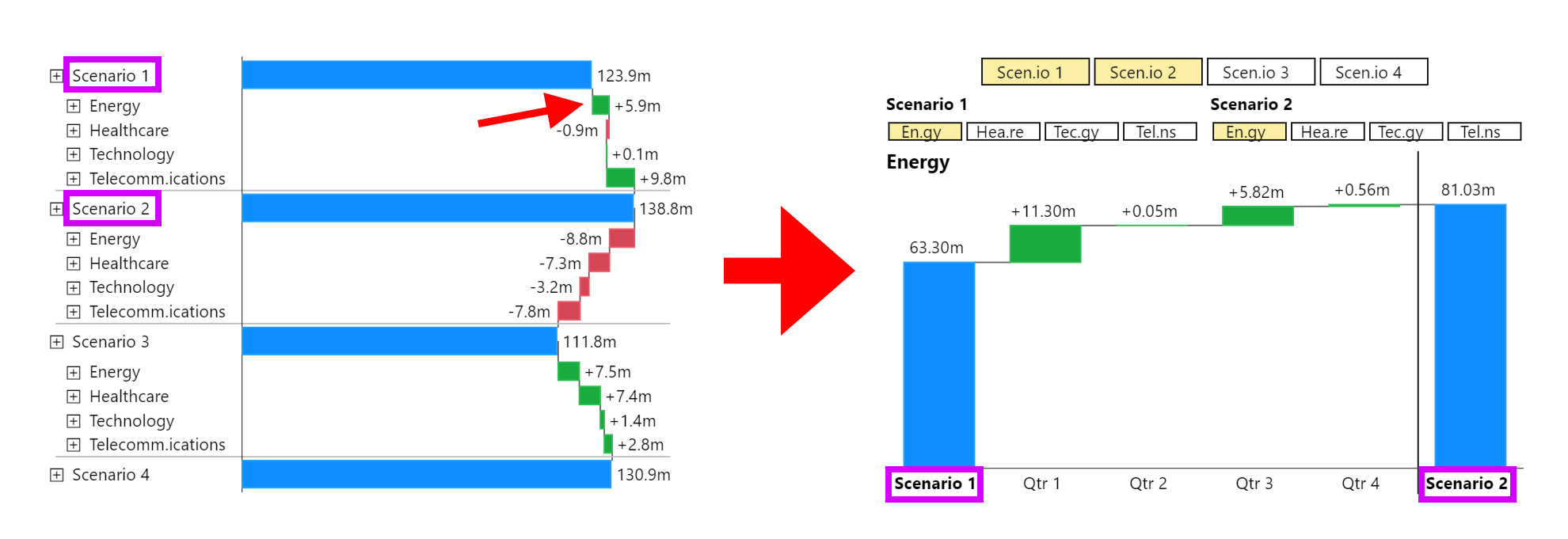
When enforcing the delta waterfall scheme, if you compare elements that do not share common sub-elements (such as comparing quarters by their months), an unusual waterfall may be displayed. This chart first draws all elements of the initial value down to the zero line and then adds up all elements from the end value, leading to a chart like the example below:
Additionally, it's worth noting that the first drill down into a forced delta chart drills down two levels. This happens because the start and end values are selected, and the selected element is compared over their children, resulting in a chart like this:
Last updated