# Overview
Welcome to the documentation for Innofalls, a powerful custom visual for Power BI that enables you to create insightful and dynamic waterfall charts. This guide will help you navigate the features and functionalities of Innofalls, providing step-by-step instructions to make the most of your data visualizations.
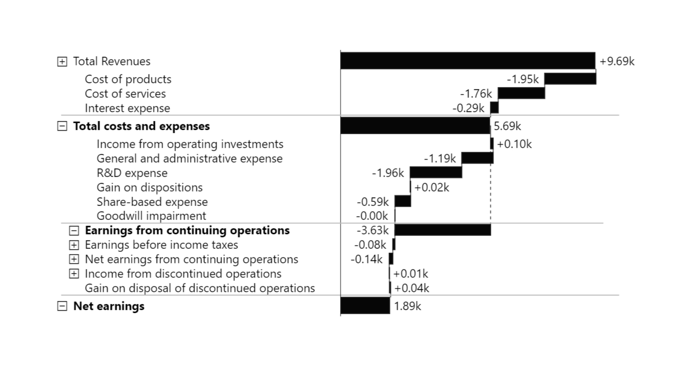
Basic Waterfall Chart
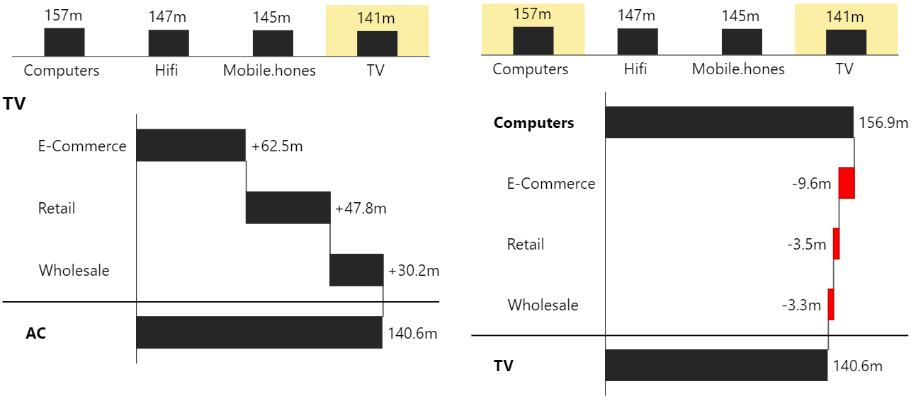
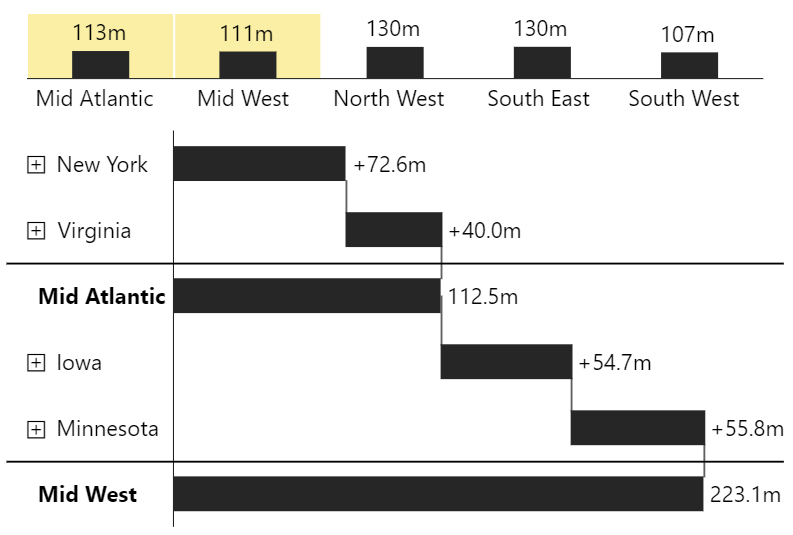
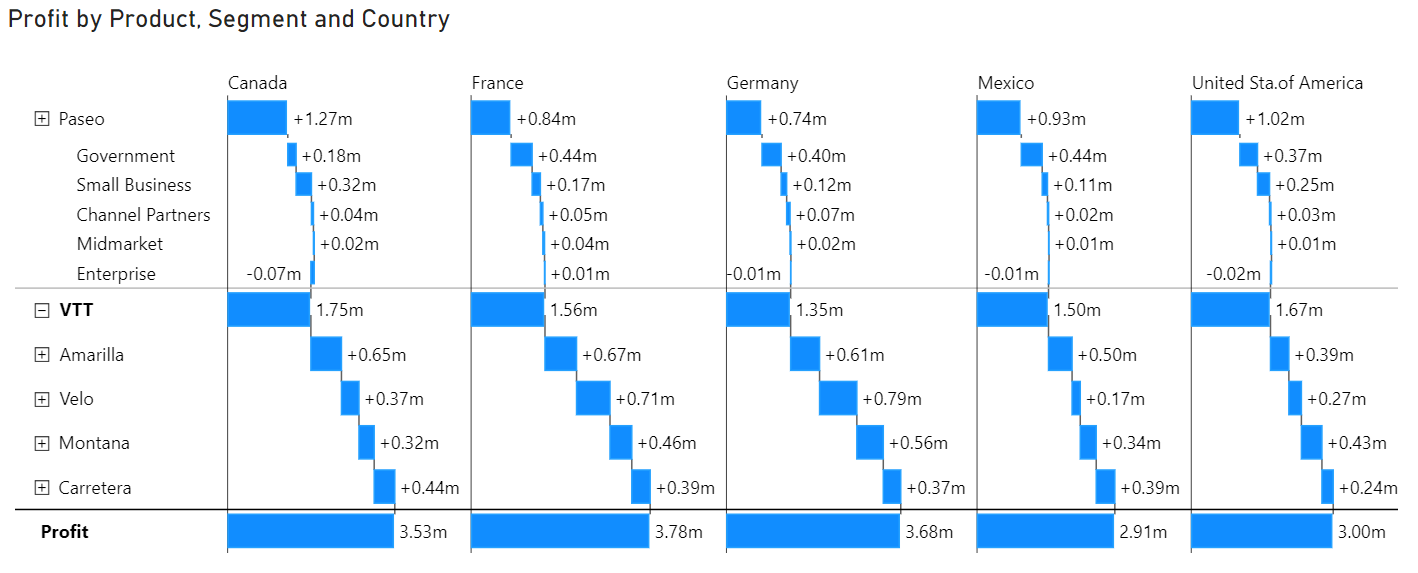
Innofalls offers a range of features to enhance your data visualization experience. You can effortlessly create comprehensive waterfall charts, delve deep into your data with drill down history, and dynamically compare data using deviation charts. The visual also allows you to stack and group data by columns for better organization and add specialized deviation charts to analyze differences between measures.
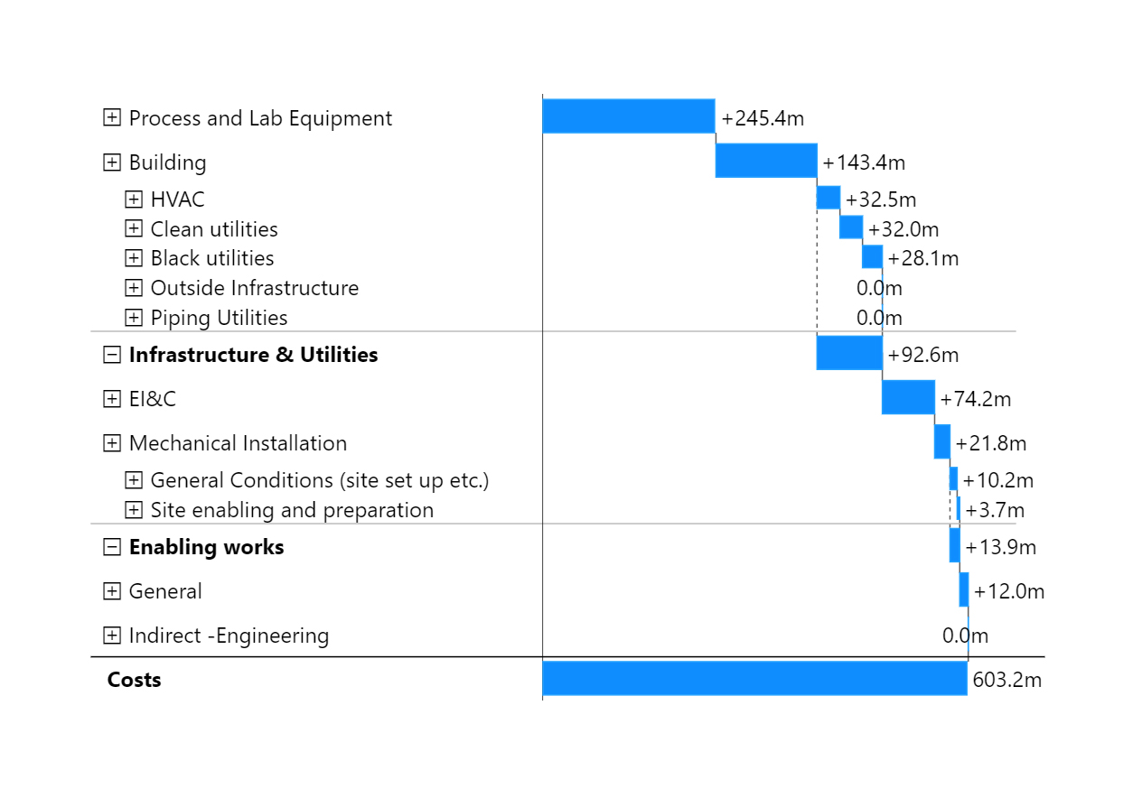
Complex Waterfall Chart
#### Getting Started
To begin with Innofalls, you'll need to follow the [installation process](/getting-started/installation). The documentation provides step-by-step instructions on how to install the Innofalls visual from Microsoft AppSource and add it to your Power BI report. Once installed, you can [set up your initial waterfall chart](/getting-started/create-your-first-waterfall) by filling in the necessary fields like Levels and Values, providing the foundation for your data visualization.
#### Data Fields
Innofalls provides various [data fields](/getting-started/data-fields) to customize your waterfall charts effectively. The Levels field is required for dimensions and allows you to add one or more dimensions, enabling drill-down capabilities with each additional dimension breaking down the previous one. The Values field, also required, is for measures, and you can add one or more measures to stack the values of each category in your chart.
The [Values From](/getting-started/data-fields/values-from) field is optional and helps visualize differences between measures by calculating deltas between the measures in "Values" and "Values From." The [Stack / Columns](/getting-started/data-fields/stack-columns) field, also optional, is used to stack values or create multiple columns based on the selected dimension, and you can switch between columns or stack mode in the chart type menu. Finally, the [Delta Fields](/getting-started/data-fields/delta-fields) allow for the creation of deviation charts by filling these fields with exactly two measures, enabling a detailed comparison between them.
#### Interactivity
Innofalls enhances interactivity with features like [navigation controls](/interactivity/navigation), [keyboard shortcuts](/interactivity/navigation/keyboard-shortcuts), and [drill down history](/interactivity/navigation/drill-down-history). You can add and adjust [deviation charts dynamically](/interactivity/dynamic-deviation-charts) based on selected data elements, and the drill down history allows you to maintain and review a history of drill down steps, facilitating a easier understanding of the exploration of your data.
#### Chart Types
The documentation provides an overview of different [chart types](https://github.com/Innofalls/InnofallsDocs/blob/master/broken-reference/README.md) supported by Innofalls, including bar charts, stacked bar charts, and various [waterfall schemes](/chart-types/waterfall-charts). You can learn how to [add deviation charts](/chart-types/adding-deviation-charts) to your main chart and switch between different types, offering flexibility in how you present your data.
#### Formatting
Customize your charts with various formatting options. The documentation covers [label formatting](/formatting/number-formatting), [themes](/formatting/themes), [colors](/formatting/colors), and [conditional formatting](/formatting/conditional-formatting) (coming very soon), allowing you to tailor your visuals to your specific needs. It also includes examples of specific use cases, such as [profit and loss statements](/examples/profit-and-loss-statement) and [IBCS styled bar charts](/examples/ibcs-styled-bar-chart-with-deviations) with deviations.
#### Examples
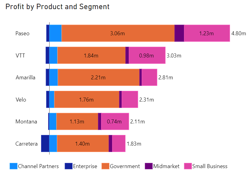
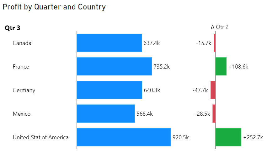
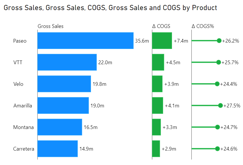
The documentation provides further practical examples showing different ways to use Innofalls. These include creating [waterfalls in columns](/examples/quick-examples/waterfalls-in-columns), [stacking products by segments](/examples/quick-examples/products-stacked-by-segments), and comparing [measures across quarters](/examples/quick-examples/comparing-measures). These examples help you understand how to apply Innofalls to real-world scenarios.
#### Licenses
Information on acquiring and [assigning ](/licenses/assign-paid-licenses)different types of licenses is available, including [free](/licenses/free-license), [trial ](/licenses/trial-license)and [paid ](/licenses/paid-licenses)licenses. The documentation also provides information for publishing your reports that include Innofalls visuals [to the web](/licenses/publishing-to-the-web), ensuring your work can reach a wider audience.
#### Support
Stay updated with the [change log](/additional-information/change-log), which records updates and changes made to the Innofalls visual. For any queries, suggestions or issues, you can contact the Innofalls support team directly. [Head over to our contact page ](https://www.innofalls.com/contact)and write us an email. If you have an issue with the product itself, feel free to [open a ticket](https://www.innofalls.com/open-ticket).
# Installation
How to install an set up Innofalls inside Power BI
Innofalls is available over Microsoft AppSource like any other custom visual.
You can find it if you go to the list of visuals available for your report and click the button with the three little dots. Open “Get more visuals” to open AppSource.
Search for "Innofalls" and open the product page. By clicking the "Add" button, you add the Innofalls visual to your report.
After installation, you should see the Innofalls icon in your list of custom visuals. Click on it, to convert any selected visual into the Innofalls visual. Or click on an empty space on your report and then click the button to create a new one.
Innofalls visual without data, showing help topics
If you are using Power BI Desktop, you can immediately start using it without restrictions. If you are using Power BI Service you either need to [acquire a license](https://www.innofalls.com/acquire) or you can start a [free 30 day trial here](https://www.innofalls.com/request-trial).
# Create Your First Waterfall
After [installing ](/getting-started/installation)Innofalls Charts and creating a new visual in your report, you are ready to create your first waterfall chart.
### Basic Setup
To create a waterfall chart, you need to fill at least two fields: **Levels** and **Values.** For example, fill in *Market* into Levels and *AC* into Values. This already shows a running totals waterfall chart. The chart shows a total bar at the end, summing up all previous data points.
Levels and Values filled
{% hint style="info" %}
Note that Innofalls automatically chooses temporal orientation (some say rotation), if you fill in a temporal dimension. You can set a fixed orientation in the menu. [Read more.](/chart-types/chart-orientation-time-structure)
{% endhint %}
Temporal Orientation with Date
### Stacking
When you add multiple measures into *Values*, you get a stacked waterfall chart.
Stacking two measures
Stacking is the default option for multiple measures. If you prefer to have each measure in a separate waterfall chart, you can do so by choosing a [Stack / Column](/getting-started/data-fields/stack-columns) option.
### Drill Downs
To enable *drill downs*, you have to add two or more dimensions into *Levels*. This gives you the option to click an element to see how it is made up.
Also note that a *plus icon* appears next to each category, which enables you to [*expand*](/chart-types/waterfall-charts/intermediate-totals) it.
Drill Downs enabled
Now, if you click an element in the chart, you will make a drill down into it. In this case we drilled into *Energy*, to see all underlying *Accounts:*
You will notify 4 buttons above the main chart. This is our [drill down history](/interactivity/navigation/drill-down-history). It gives us a retrospection on our previous level. Depending on the size of the visual, the drill down history will be shown as a chart (enough space) or as buttons (less space).
The drill down history offers an important ability: We can select **additional elements** from the previous level to drill down into.
### Delta Waterfall Chart
Select another element with a click *while holding down the control key (CTRL)*. The Innofalls visual creates a delta waterfall between the two selected elements, automatically calculating the differences between the two.
Delta Waterfall between two selected elements
You can select any combination of elements in the history, to make the comparisons you need.
{% hint style="info" %}
Note that by default, the waterfall type is selected automatically. When two or more elements in the drill down history are selected, the visual chooses the delta waterfall. If you need to keep the running totals visualization, you can change the type anytime in the menu.
{% endhint %}
### Usage Considerations
At this point, you can finalize the chart in its current form by [hiding the drill-down history](/interactivity/navigation/drill-down-history#showing-hiding-drill-down-history) and [disabling navigation controls](/interactivity/restrict-user-controls), making it ready for your report. This ensures that the report viewer cannot make further modifications to the chart.
Alternatively, you can keep the drill-down history and controls enabled, allowing experienced report viewers to interact with and explore the visual data in greater detail.
### Customization
The Innofalls Charts offer you a lot of customization options, accessible from the property pane. For example, by default the category width is limited. To disable this, locate the property *Limit Category Width* under *Sizes and Spaces* to disable this. In our case this makes our Drill Down History elements wider and more legible.
Now that you created your first waterfall chart, head to the next section to read about all the data fields our visual has to offer.
# Data Fields
An overview over all data fields available
The Innofalls visuals offers several data fields, most of which are optional. Depending on your requirements, you need to fill different fields. The following list gives you a quick abstract for each data field. [See our quick examples list, for sample configurations.](/examples/quick-examples)
Field
Levels Required. Dimensions. One or more.
Put here the dimensions you want build up the waterfall with. These are the dimensions for which you can do a drill down. Each additional dimension becomes the breakdown of the dimension above.
Stack / Columns Optional. Dimension. Up to one.
If you fill this field, the visual uses the dimension to build a stacked waterfall or stacked bar chart (in stack mode) or creates multiple columns (in column mode) for each member of the dimension.
You can switch between columns or stack anytime in the chart type menu.
Values Required. Measures. One or more.
Here you fill in the values of your chart. If you add multiple measures, the chart stacks the values of each category.
Values From Optional. Measures. None or more.
If you add values in here, the waterfall calculates the deltas between measures. The delta is calculated between the sum of “Values From” and the sum of “Values”.
Stacked Bar Charts show a second column, if this field is filled.
Note:The waterfall chart can’t be set to “Running Totals” if you fill this field.
Delta 1
Delta2
Delta 3
Optional. Measures. Exactly two.
All delta fields behave the same.
If filled with two measures this adds a deviation companion chart to your base chart. It calculates the deviation between those two measures for each category of the current base chart. By default, the deviation chart calculates the absolute deviations between the two measures. You can switch to percentage or absolute waterfall deviation in the menu.
# Values From
If you need to visualize the difference from one measure to another you can use this field. For example, if you have *Actual* (AC) and *Previous Year* (PY) as measures in your data, you can add *Previous Year* into this field and *Actual* into the *Values* field.

If you fill this field, the waterfall chart type automatically is in delta display. Running totals cannot be chosen.
You can add multiple measures into the fields. The delta is then calculated between the sum of all measures of each respective field.
If you switch to stacked bar chart, the values from *Values From* build a second column.
# Stack / Columns
The *Stack / Columns* field can be used to either stack values of a dimension on top of each other or to split values into columns (or rows in time orientation). Whether stacks or columns are created is determined by the *Stack / Column mode* in the menu. The default setting is *Stack Mode*.
### Stacking
Besides adding multiple measures into the *Values* field, you can create a stacked waterfall or bar chart by adding a dimension into the *Stack / Columns* field while in **Stack Mode**.
Each element of the chart is then split into multiple segments. The basic bar chart creates multiple series from the stacking dimension.
Stacking by Product, "Power BI" Theme for more contrasting colors
### Columns
Another use of this field is splitting the chart into multiple columns in **Column Mode**. You can select this mode in the menu:
Stack / Column Mode Selection
{% hint style="info" %}
You can also select the Stack / Columns Mode in the property pane.
{% endhint %}
You have the choice of three modes for columns, which allow for each combination of stacking and/or columns of the *Stack / Column* dimension and multiple measures in the *Values* field.
Columns by Dimension / Measure
Create a column for each combination of measures and members.
A dimension Product with 4 members and 2 measures in values creates 4 x 2 = 8 columns.
Columns by Dimensions
One column for each member of the Stack / Column dimension. Multiple measures in the Values field are being stacked.
Columns by Measures
One column for each measure. The dimension from the Stack / Column field is used for stacking.
Columns by Dimension (Product)
{% hint style="warning" %}
Please note that for performance reasons the count of columns is limited to 12.
{% endhint %}
# Delta Fields
The Delta fields are used to create measures deviation charts, showing the difference between two measures.
Delta Field 1 to 3
Each field must be filled with exactly two measures. For each deviation chart the chart type can be selected individually.
For more details please read [Adding Deviation Charts](/chart-types/adding-deviation-charts).
# Videos
If you prefer to have things explained in a video, have a look at our [YouTube content](https://www.youtube.com/@innofalls).
{% embed url="" %}
Getting Started - The Basics
{% endembed %}
{% embed url="" %}
How the Drill Down History Works
{% endembed %}
{% embed url="" %}
How to Make Comparisons
{% endembed %}
# Navigation
To make exploring your data easier, we've incorporated some helpful features.
We included a [navigation bar](/interactivity/navigation/navigation-menu) on the top right which is similar to the Power BI drill down controls. It offers additional features like undo / redo and zoom.
Navigation Bar (Red Box)
Also, have a look at the [keyboard shortcuts](/interactivity/navigation/keyboard-shortcuts).
When you navigate the visual, the [Drill Down History](/interactivity/navigation/drill-down-history) will provide orientation and will offer new ways to make comparisons in your data.
Drill Down History
The [Drill Down Preview](/interactivity/navigation/drill-down-preview) helps you to identify elements with a high volatility in the underlying level.
# Navigation Menu
On the top right of the visual you see the navigation menu.
The navigation menu is visible all the time, unless disabled for the viewer. This can be done in the [menu restrictions](https://github.com/Innofalls/InnofallsDocs/blob/master/interactivity/navigation/broken-reference/README.md). For example, if you use a visual as a report page tool tip or the viewer isn't allowed to do drill downs.
When you are exporting the report as a PDF or to Power Point, the menu will be disabled automatically.
The following list explains each symbol:
Undo
Goes back to the previous navigation step. This includes drill downs and expansions.
Undo and Redo do not have a limit in steps.
This does not undo property changes.
Redo
Goes forward a navigation step. The opposite of Undo.
Level Up
Drill Mode On
When this button is active, a click onto an element initiates a drill down into the selected element.
Click this button and Drill Mode is toggled off and you enable Selection Mode.
Selection Mode On
In Selection Mode you can select elements in the visual to filter other visuals in your report by this value.
Click this button and Selection Mode is toggled off and you enable Drill Mode.
Expand All Nodes of Current Level
Open each node of the current dimension level and shows the underlying nodes. If all nodes are already opened or no nodes can be expanded, this will be shown grey.
This can be helpful to quickly inspect the composition of all nodes of the current level.
Collapse All
Close all expansions of the current level. Is the opposite of the above.
Sort and Top N Sorts all categories by a specific criteria. See Sorting for more.
Zoom
The magnifying symbol toggle the zoom. The visual tries to determine the optimal zoom range for small waterfall deltas automatically. To adjust the zoom manually you can click the chevron icon next to it. This shows the zoom range, where you can select the zoom minimum and zoom maximum .
# Keyboard Shortcuts
Te help you quickly navigate the visual, we added a few keyboard shortcuts.
CTRL + Click
Selects multiple elements in the Drill Down History.
In Selection Mode you can also select multiple elements in the main chart.
Shift + Click
Expands or closes an element. The same as clicking the symbol next to the category label.
Comma ( , )
Undo
Period ( . )
Redo
# Drill Down History
Combine drill downs for a deeper understanding
Our drill down history, which is enabled by default, visualizes the data you drilled down from in small charts above the main chart and looks like this:

In this example the dimensions in the *Levels field* are **Year**, **Quarter** and **Month** and we made a drill down into **2022** and then **Qtr 3**. As you can see, only the last history level is visualized as a chart. The preceding levels are visualized as buttons. This is done to prevent them to take up too much space.
### Showing / Hiding Drill Down History
The Drill Down History can be hidden/shown here:

### What is the use of the drill down history?
The drill down history offers several advantages. Beneath offering you a way to keep track where you are, if enables you to *combine several drill downs*.
When you selected additional elements in your drill down history (hold the CTRL key to select more elements), they are combined into one chart. This gives you the ability to combine arbitrary elements in your data with just a few clicks.
The elements you select in the drill down history are applied as filters to other visuals in your report. You can disable this in the property pane with the property "Filter Other Visuals" in the section "Behavior".

You might dynamically compare business units with each other and inspect, where they performed differently.
### Dynamic deviation charts
Another feature available through the drill down history is the selection of dynamic deviation charts. [Read more about them in this section.](#dynamic-deviation-charts)

# Drill Down Preview
Get to see what is coming next
The *Drill Down Preview* is a feature which is still in experimental stage. It shows you what to expect after the next drill down in a little chart next to your main visualization. Imagine it to be a signpost if the size of a value corresponds to the values it is made up.
It can be activated in the Review / Preview Menu:

The Drill Down Preview visualizes the **sigma** (standard deviation) of the underlying values for an element in your chart as blue bars.
Here is an example:

In this case, the sizes of sigma correspond roughly with the sizes of the main waterfall chart. But let us have a look at another example:

In this chart we can see, that the sigma for *Consumer* is significantly higher than the actual delta. If we expand the node, we immediately see why:

The volatility of the values is rather high, compared to the very small delta. When the underlying deltas are summed up, the result indicates a small change. But it hardly reflects, what happens below. This is, what the drill down preview is meant to visualize.
# Selections
To select elements in the Innofalls visual, you have to disable the *drill mode* in the navigation menu, like you would in any other Power BI visual:

When drill mode is off, you can select elements in the main chart, to filter other visuals.
The Innofalls visual shows highlighted values, when you select values in other visuals
# Dynamic Deviation Charts
The [Drill Down History](/interactivity/navigation/drill-down-history) allows you to dynamically add deviation charts. When you hover over an element in the history, a little icon appears:

With it, you can toggle a dynamic deviation chart for the respective category (member). When the deviation is activated for that member, an icon will be shown on the top right of the category:

If you wish to change the chart type of the added deviation chart, you can do so in the menu. To remove the deviation chart, you can either click the toggle button again, or remove it in the deviations menu.
{% hint style="info" %}
**Note**
Not all navigation steps can display valid deviation charts for some members. For example, when you view the months of **Q4** and you selected **Q3** as a deviation member, no deviation can be shown. Q3 simply does not contain months comparable to Q4.
Also with delta waterfall charts, there are cases where there is no valid comparative data.
Please keep this in mind. At the time being, no hints are displayed in such cases. We will add this in a future release.
{% endhint %}
{% hint style="info" %}
**Note**
At the moment, unlike with delta charts created from measures in the delta fields, you can not create delta waterfall charts from dynamical selections.
{% endhint %}
# Sorting and Top N
The Innofalls Chart offer you the possibility to sort the elements in a chart. You can specify by which measure and/or dimension the chart should be sorted by. You can also sort by deviations to quickly identify elements with the largest impact.
Sort and Top N Settings
You can activate sorting by either **clicking on a axis label**
or by clicking the **Sort and Top N** button in the [navigation menu](/interactivity/navigation/navigation-menu).
{% hint style="info" %}
When *Top/Bottom N* is active, you can also click the **Rest** label to open the settings dialog.
{% endhint %}
### Sorting
When more than one measure or additional deviation charts are available in the visual, you can choose by which measure to sort by.
When the *Stack / Columns* field contains a dimension, you can select which member to sort by.
#### Sort Options
None
No sorting; the sort order given by Power BI is applied
Up
Sorts the values with the lowest value first by the specified sort measure. If only one measure is present in the chart, that one is taken and no measure choices are available
Down
Sorts the values with the highest value first by the specified sort measure. If only one measure is present in the chart, that one is taken and no measure choices are available
### Top / Bottom N
You can apply this option, if you wish to limit the amount of elements shown in the chart. When this constraint is active, the N number of elements with the highest (top) or lowest (bottom) values are shown and all other elements are summarized in a *rest member*.
You can either specify a fixed number of elements to keep or you can choose one of the *Auto* settings to determine the number of elements to keep automatically. Auto is a good choice for responsive reports (e.g. mobile reports). The smaller the visual, the fewer elements are visible.
If the number of elements present is less than the constraint N, no *Rest* is generated.
{% hint style="info" %}
You can rename the *Rest* member in the property pane under *Sorting + Top N.*
{% endhint %}
#### Top / Bottom N Options
None
No Top / Bottom N is applied
Auto Top
Keep top elements.
The amount of elements is determined by the size of the visual.
Auto Bottom
Keep bottom elements.
The amount of elements is determined by the size of the visual.
Top
Keep top elements specified by N.
Bottom
Keep bottom elements specified by N.
# Highlighting
The visual allows you to highlight changes between elements as arrows at the side:

Highlighting in general can be toggled by the highlights button in the menu:

When you open the menu, you have the predefined choice of **Min/Max** and **First/Last**. They can be toggle independently.
If you wish to add highlights between other elements, you can create them with **Add New.** A window will appear and you will be asked to select two elements one after the other. After adding a new highlight, an entry will appear in the menu, which allows you to remove the custom highlight.
# Restrict User Controls
By default, most menu controls are available to viewers in reading view, allowing them to adjust the chart to their preferences.
If you wish to restrict this functionality, you can limit which controls users are allowed to use. To do this, access the "Allowed User Controls" dialog here:
Allowed User Controls
This ensures that users can only interact with the chart in ways you permit.
Allowed User Controls Dialog
# Animations
Innofalls charts animate changes to the data. Care is taken to only move or resize elements if they represent the same data. For example, when new data is added, the elements move to the new location. However, if a change to the filters removes the year 2022 and adds the year 2023, the elements will not animate, but new elements will appear.
The animations help prevent the effects of so-called **change blindness** and keep track of old elements when new ones are added.
But not all people prefer animations or need slower movements. To disable the animations or make them slower you can do this on the property pane of Power BI under behavior:
# Overview
The Innofalls visual includes several chart types to choose from and we intend to constantly expand this selection. You can select those chart types from the property pane or in the menu:

First and foremost we offer different types of waterfall charts as the main chart:
Running Totals Waterfall Chart
This adds up multiple values and can show intermediates either as sub sums or intermediate totals.
Delta Waterfall Chart
Comparing two (or more) elements (or members) with each other in how they change over a dimension.
Measure Delta Waterfall Chart
In contrast to the chart above, this chart compares two measures and shows how they differ along one dimension.
Furthermore we offer:
| | | |
| ---------------------------------------------------------------------------------------------------------------------------------------------------------------------------------------------------- | ----------------- | ----------------------------------------------- |
|  | Bar Chart | Show one or more series of measures. |
|  | Stacked Bar Chart | Stack up measures and / or the stack dimension. |
All charts can be shown in structure orientation or time orientation (vertical axis or horizontal axis). Additionally, all charts (except bar chart) can stack up with more than one measures or a [stack dimension](https://github.com/Innofalls/InnofallsDocs/blob/master/chart-types/broken-reference/README.md).
Have a look at the [deviation charts](/chart-types/adding-deviation-charts), to see how to create them.
# Waterfall Charts
Innofalls Charts provide several distinct types of waterfall charts, each serving unique purposes and offering valuable insights into your data. Below is a summary of these chart types with links to their detailed subsections:
## **Running Total Waterfall Charts:**
* These charts break down a final sum into its constituent contributions, such as income statements or cash flow analysis.
* They are excellent for tracking cumulative values over time or across categories.
* Running Total Waterfall Charts are further subdivided into charts with intermediate totals and sub totals, offering different levels of data aggregation.
* [Read more about Running Total Waterfall Charts](/chart-types/waterfall-charts/running-intermediate-total-waterfalls)
Simple Running Totals Waterfall Chart
## **Delta Waterfall Charts Between Members:**
* These charts compare two specific values (such as two years) by showing deviations between the intermediate elements.
* You can either use the default "auto" scheme for flexible element comparison or enforce the Delta Waterfall Scheme through the menu for a consistent view.
* [Read more about Delta Waterfall Charts Between Members](/chart-types/waterfall-charts/delta-waterfall-charts)
Delta Waterfall Chart
## **Measure Delta Waterfall Charts:**
* These charts compare different measures over the course of various members, providing insights into how the start and end measures change across a dataset.
* They require filling in both the "Values From" and "Values" fields, and allow for the comparison of aggregated measures.
* [Read more about Measure Delta Waterfall Charts](/chart-types/waterfall-charts/measure-delta-waterfall-chart)
Measure Comparison Waterfall Chart between PP to AC
## **Deviation Waterfall Charts:**
* These charts can be added on top of an existing chart to visualize and accumulate deviations, making it easy to see how individual elements contribute to overall deviation from a baseline.
* They are particularly useful for variance analysis in performance metrics and budget comparisons.
* [Read more about Deviation Waterfall Charts](/chart-types/waterfall-charts/deviation-waterfall-charts)
Deviation Waterfall Chart (Right)
## Automatic Waterfall Selection
If Auto is selected, the waterfall will be shown as a running totals waterfall, *unless* two or more elements in the drill down history are selected. Then a delta waterfall is built. With one exception: If the selected elements don't have children in common (like Quarters, which have different months as children), a running totals waterfall will be built.
See [Automatic Chart Selection](/chart-types/automatic-chart-selection) for more details.

# Running / Intermediate Total Waterfalls
A running total waterfall chart is effective in visualizing how different components contribute to a cumulative total over time or across various categories. This type of chart starts with an initial value, which serves as the baseline. As you add or subtract subsequent values, the chart visually demonstrates how each individual component affects the overall cumulative total. This method is particularly useful for financial analysis, such as income statements, where it’s crucial to understand the impact of each revenue and expense item.
{% hint style="info" %}
The running total waterfall chart is the default setup for Innofalls Charts. It will be chosen automatically if applicable or you can set it manually:
{% endhint %}
## **Example Use Cases:**
Income Statements
Perfect for illustrating how different revenue and expense items add up to the net income.
The chart begins with an initial value, such as the starting revenue or initial balance. From there, each bar in the chart represents an incremental step, either positive or negative, showing how individual items contribute to the total. For example, in an income statement, you might start with total revenues, then subtract costs of products, costs of services, and other expenses to arrive at a net income figure.
By effectively utilizing intermediate totals, you can gain a clear and concise summary of key data segments. In the next section, we will explain the two types of totals: **intermediate totals** and **subtotals**.
# Intermediate Totals and Sub Totals
Intermediate totals and subtotals play crucial roles in breaking down and summarizing complex data within a running total waterfall chart. While intermediate totals provide high-level summaries of major categories, subtotals offer a more detailed breakdown within these categories, allowing for a comprehensive understanding of each segment.
A total will be shown when you expand an element by clicking the *Plus Icon* below a category label:
How to expand totals
You can control the totals display of the running totals waterfall with this option:
#### Intermediate Totals
Intermediate totals are summary values that represent the cumulative total of several preceding data points. They act as checkpoints within the chart, helping to segment and summarize different sections of the data. For instance, after listing all revenue items, an intermediate total like "Total Revenues" provides a clear summary before moving on to the next section of the income statement.
Intermediate totals are particularly useful for breaking down complex data into more manageable segments. They provide a high-level overview of major categories, such as total revenues or total costs and expenses, before delving into further details.

#### Sub sums / Subtotals
Subtotals, also known as sub sums, are more granular and represent the cumulative total of a subset of data points within a segment. They provide detailed insight into smaller groups of related data points, helping to understand how specific elements within a category contribute to the overall total. For example, within the "Total Costs and Expenses" section, subtotals might include operating expenses, administrative expenses, and R\&D expenses.
Subtotals are nested within intermediate totals, offering a finer breakdown of the data. They are essential for gaining a deeper understanding of the components that make up each intermediate total, allowing for more detailed analysis and insights.

#### Difference Between Intermediate Totals and Subtotals
The main difference between intermediate totals and subtotals lies in their scope and level of detail. Intermediate totals cover larger segments or entire sections of the chart, providing a summary of major categories. In contrast, subtotals focus on smaller groups within these segments, offering a more detailed breakdown.
Intermediate totals act as high-level summaries, while subtotals provide detailed insights within those summaries. For example, multiple subtotals for different types of expenses can roll up into a single intermediate total for total costs and expenses.
# Delta Waterfall Charts
Delta Waterfall Charts Comparing Between Members
Delta Waterfall Charts between members are a powerful tool for visualizing data, particularly useful for comparing the differences between two specific values. This type of chart is slightly different from measure delta waterfall charts, which compare two different measures as start and end values. Measure delta waterfall charts will be explained in the next section, as they require a different setup, but fundamentally, both types serve the same purpose of highlighting deviations.
Delta Waterfall Chart between two members, the years 2022 and 2023
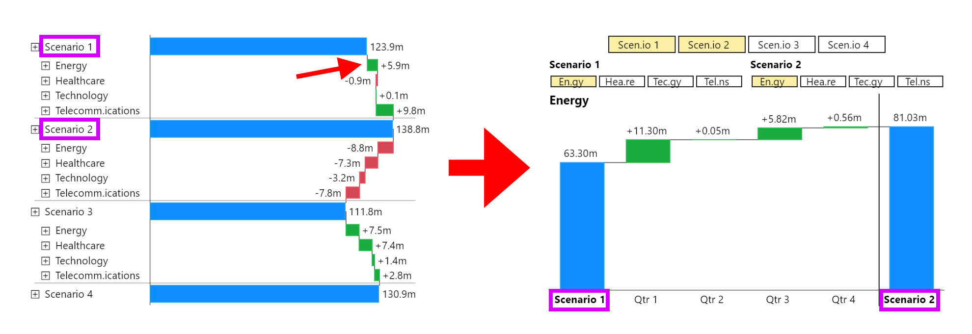
In a delta waterfall chart between members, you start with an initial value and end with a final value, and the chart displays how each intermediate element contributes to the change between these two values. For example, if you are comparing the performance of two years, the initial value would be the starting point of the first year, and the final value would be the ending point of the second year. The waterfall elements in between show how each month within those years differs from the other.
Each bar in the delta waterfall chart represents the difference between corresponding elements of the start and end values. These differences are depicted with color-coded bars: green bars indicate an increase compared to the initial value, while red bars indicate a decrease. This visual representation allows for a quick and intuitive understanding of which periods or components contributed to the overall change.
For instance, if comparing monthly sales between two years, the delta waterfall chart would start with the total sales of the previous year and end with the total sales of the current year. Each bar in between would show the difference in sales for each month, making it easy to identify which months saw growth and which saw declines.
### Visual Representation
Below is an example illustrating a delta waterfall chart comparing two years. The chart starts with the total revenue of Year 2021 and ends with the total revenue of Year 2022. The bars in between represent the monthly differences:
Delta Waterfall between two years over month
As shown in the example, each bar is color-coded to reflect the increase or decrease in revenue per month. Green bars indicate months where revenue increased compared to the same month in the previous year, while red bars indicate months where revenue decreased.
## Creating Delta Waterfall Charts
There are two options for creating a delta waterfall chart in our visual: using the default configuration or enforcing the delta waterfall scheme through the menu.
#### **Option 1: Default Configuration with "Auto" Scheme**
By sticking to the default configuration, where the scheme is set to "auto," you can create delta waterfall charts in a very flexible manner. Here's how it works:
1. **Initial Setup:** Start with the default "auto" scheme.
2. **Drill Down:** Perform a drill down into your data to explore the details.
3. **Select Elements:** In the drill down history, select another element by clicking on it while holding the control key (Ctrl). The visual will automatically construct a delta waterfall chart between the two selected elements.
Scenario 1 and Scenario two are both selected in the drill down history, to create a delta waterfall chart between the two
This method is highly flexible, allowing you to select and compare arbitrary elements with each other. You can even select multiple elements for comparison, making it easy to visualize differences between various parts of your data.
#### **Option 2: Enforcing the Delta Waterfall Scheme**
Alternatively, you can enforce the delta waterfall scheme through the menu:
1. **Select Delta Waterfall Scheme:** In the menu, choose the Delta Waterfall Scheme to force this option.
2. **Consistent Delta Waterfall:** This scheme ensures that the visual always displays a delta waterfall chart.
{% hint style="info" %}
When enforcing the delta waterfall scheme, if you compare elements that do not share common sub-elements (such as comparing quarters by their months), an unusual waterfall may be displayed. This chart first draws all elements of the initial value down to the zero line and then adds up all elements from the end value, leading to a chart like the example below:
{% endhint %}
Additionally, it's worth noting that the first drill down into a forced delta chart drills down two levels. This happens because the start and end values are selected, and the selected element is compared over their children, resulting in a chart like this:
Drill down into the first level of a forced delte chart.
# Measure Delta Waterfall Chart
Create a waterfall diagram with different measures as start and end values
Unlike regular delta waterfall charts that compare different members (such as time periods or categories) with a start and end value, measure delta waterfall charts compare different measures directly.
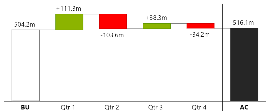
Measure Delta Waterfall between budget and actual
Here are the key steps to set up and utilize measure delta waterfall charts:
#### **Setting Up Measure Delta Waterfall Charts**
1. **Values Fields:**
* ***Values***\*\* Field:\*\* This is the always required field where you input your end measure.
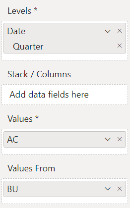
* ***Values From***\*\* Field:\*\* To create a measure delta waterfall, you need to additionally fill in the "Values From" field. This setup automatically constructs a measure delta waterfall chart, comparing the start measure (from the "Values From" field) with the end measure (from the "Values" field) across the members.
Setup for a Measure Delta Waterfall
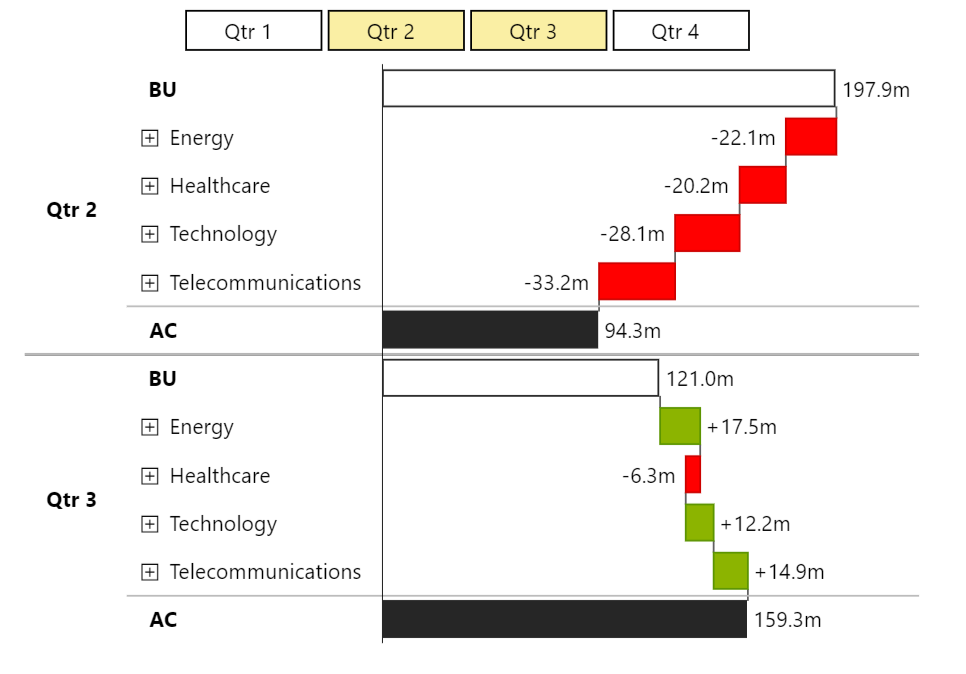
The chart compares the start measure with the end measure over the course of the members, similar to the regular delta waterfall chart, but with measures rather than time periods or categories as start and end.
Unlike the regular delta waterfall charts, you can stack several measures in each field ("Values From" and "Values"). The result is a comparison of the sum of all start measures against the sum of all end measures. However, stacking by a dimension like in regular delta waterfalls cannot be applied here. The focus is on the aggregate comparison of the start and end measures.
{% hint style="info" %}
It is not possible to concatenate delta waterfalls for several selected drill down members. Each measure delta waterfall ends with a different measure than the next one would start with, making a seamless transition between multiple waterfalls unfeasible.
{% endhint %}
Two Measure Delta Waterfalls for Q2 and Q3 without concatenation
# Deviation Waterfall Charts
Deviation Waterfall Charts are a specialized type of waterfall chart that can be added on top of an existing chart to highlight deviations over time or between categories. These charts focus on visualizing deviations, accumulating them to make it easier to see how individual elements contribute to the overall deviation from a baseline. Each bar in a deviation waterfall chart represents a deviation, with the cumulative effect clearly displayed.
Deviation Waterfall Charts are particularly useful for analyzing variance in performance metrics, budget vs. actual comparisons, and identifying areas of overperformance or underperformance.
For a detailed explanation on how to set up and use deviation charts, please refer to [Adding Deviation Charts](/chart-types/adding-deviation-charts) and [Changing Deviation Chart Types](/chart-types/changing-deviation-charts-types).
Below is an example illustrating a deviation waterfall chart, showing cumulative deviations over a series of periods:
Deviation Waterfall (on the right)
# Other Chart Types
In addition to waterfall charts we offer (stacked) bar and column charts as well. You can switch to them at any time to analyze the underlying data.
Of course they can be used independently if you want to use them with our other features, such as deviation charts.
Currently, the following chart types are available:
* [Bar / Column Charts](/chart-types/other-chart-types/bar-charts)
* [Stacked Bar / Column Charts](/chart-types/other-chart-types/stacked-bar-charts)
# Bar Charts
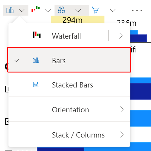
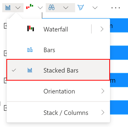
To select bar / column charts, you select *Bars* in the menu. To create a column chart switch the orientation to *Time*.
#### Multiple Series
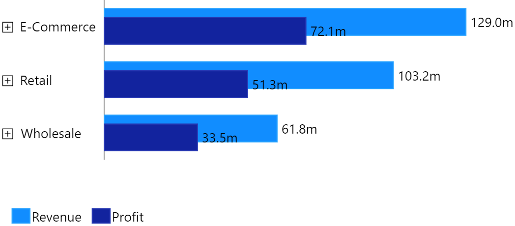
The series of a bar chart are made up from the measures in the *Values* field. Additionally the dimension in the *Stack / Column* field creates a series for each member, when in *Stack Mode*.
Bar chart with two measures and the Power BI theme applied
#### Grouping
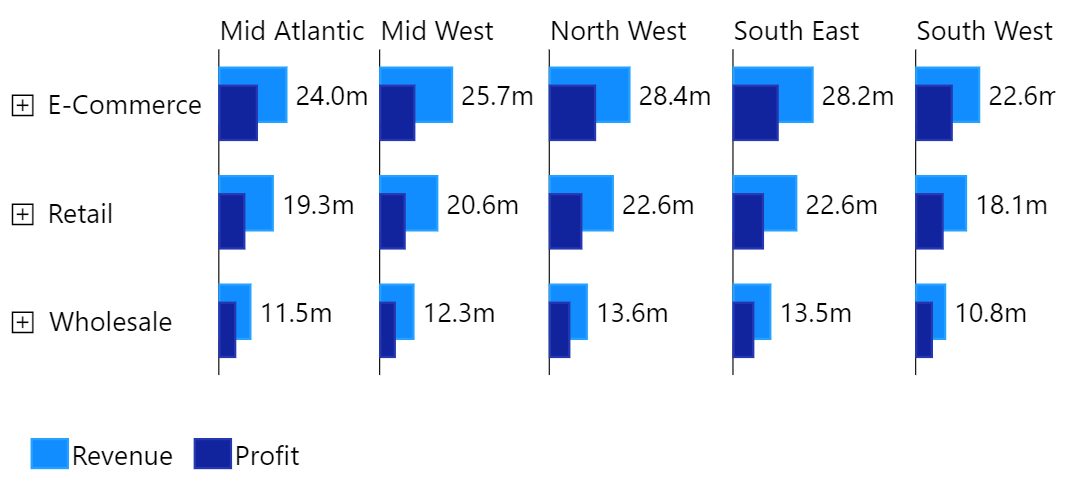
When you are selecting *Column Mode* you get bar charts grouped in columns by the *Stack / Columns* dimension.
Bar chart grouped into columns by Region
#### Expanding
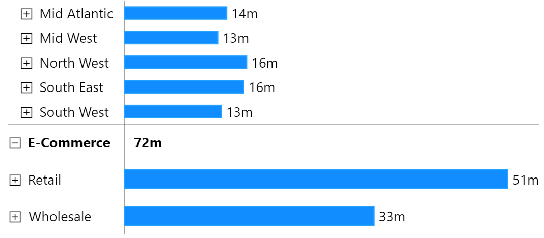
When you expand a node in a bar chart, the sub categories are shown in place:
E-Commerce expanded
# Stacked Bar Charts
To select bar / column charts, you select *Bars* in the menu. To create a column chart switch the orientation to *Time*.
#### Stacking Values
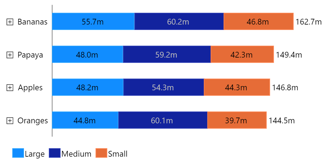
The stacked bar charts stacks measures on top of each other. When in Stack Mode, the dimension in the Stack / Column field is used to create a segment for each combination of measure and member.
One measure stacked by Size - Power BI theme applied
#### Grouping
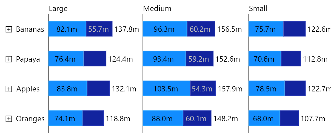
When you are selecting *Column Mode* you get bar charts grouped in columns by the *Stack / Columns* dimension.
Two measures grouped by Size
#### Expanding
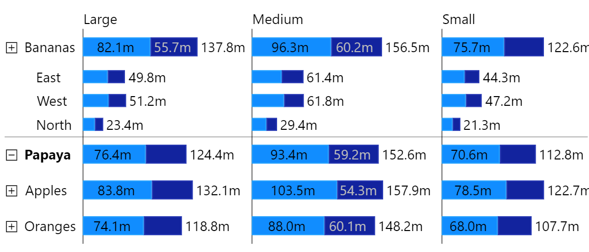
When you expand a node in a stacked bar chart, the sub categories are shown in place:
# Automatic Chart Selection Feature
The Automatic Chart Selection feature in Innofalls Charts simplifies the process of choosing the right chart type by intelligently adapting based on your data and interactions. When the waterfall scheme is set to "Auto," the visual will automatically decide whether to display a running totals waterfall chart or a delta waterfall chart, depending on the number of elements selected in the [drill down history](/interactivity/navigation/drill-down-history).
**How It Works**
* **Single Element Selection:** If only one element is selected in the drill down history, the visual defaults to a running totals waterfall chart. This chart type is ideal for showing cumulative totals, such as tracking the sum of revenues or expenses over time.
* **Multiple Elements Selection:** When two or more elements are selected, the visual switches to a delta waterfall chart. This type of chart compares the selected elements against each other, highlighting the differences between them.
Single Selection (left, Running Totals) vs. Multiple Selections (right, Delta Waterfall)
{% hint style="info" %}
You can enforce [*Running Totals*](/chart-types/waterfall-charts/running-intermediate-total-waterfalls) or [*Delta Waterfalls*](/chart-types/waterfall-charts/delta-waterfall-charts) by selecting that scheme in the menu.
{% endhint %}
**Exceptions**
There are cases where the default behavior might change. For instance, if the selected elements do not share common child elements (e.g., different quarters like Q1 and Q2, which have different months), the visual will revert to a running totals waterfall chart instead of a delta waterfall chart. This ensures that the chart remains meaningful and accurately represents the data.
Running Totals Chart, despite two selected elements
#### Benefits
* **Ease of Use:** Users do not need to manually select the chart type; the visual makes an intelligent choice based on the data selection.
* **Flexibility:** You can explore data interactively and the visual adapts to provide the most relevant chart type, ensuring clarity and insight.
{% hint style="success" %}
Additionally, explore the [**Automatic Chart Orientation**](/chart-types/chart-orientation-time-structure) feature, which ensures your charts are always oriented correctly based on the data, enhancing the visualization experience. Read more about Automatic Chart Orientation.
{% endhint %}
# Chart Orientation / Rotation
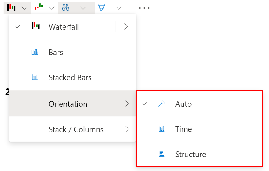
Orientation selection in the menu
The *rotation* of the charts is defined by their *orientation*.
By default, the orientation is set to *Auto*. With *Auto* set, the visual adjusts to the current dimension of the levels field. Temporal dimensions are shown in time orientation (horizontal axis) and others in structure orientation (vertical axis).
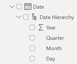
Temporal dimension are dimensions that are part of a *date hierarchy*:
Temporal dimensions
**You can override this behavior by selecting \_Time***\*\* or \*\****Structure**\_\*\* explicitly.\*\*
# Adding Deviation Charts
You can add deviation charts in two ways. Which method you choose depends on whether you want to compare measures or members.
### Comparing Measures
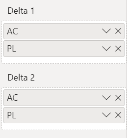
To compare two measures in a chart you have to add **exactly two measures** into any **Delta** field. If you just fill in one measure, it will be ignored. The deviation charts appear in the order of the Delta fields. Delta1, Delta2 and Delta3 accordingly.
To invert the calculation, invert the order of the measures in the delta field.

This setup will show the deviation between AC and PL as a deviation chart named *ΔPL*.
To remove a measure deviation chart, simply remove the measures from the Delta field.
### Comparing Members
Innofalls offers a simple and intuitive way to add deviation charts between members. You need to utilize the [Drill Down History](/interactivity/navigation/drill-down-history) for this. Make sure the Drill Down History is enabled. The binoculars symbol in the menu must have a grey background for this.

After making a drill down, you will see the drill down history chart above your main chart. If you hover over any category of it, a little blue button will appear:

When you click it, this will create a deviation chart between the currently selected element (here with a yellow background) and the deviation members selected (here *Mobile Phones*). This will create the deviation chart for
Δ Hifi - Mobile Phones
There is one important detail to this: If you now change the selected element - to *Computers* for example - the deviation will adjust to the new selection and it will show the deviation chart for
Δ Computers - Mobile Phones
You can click the blue button again to toggle a deviation off.
# Changing Deviation Charts Types
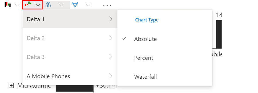
In order to change the deviation chart types, you have to enter the menu.
For each active deviation chart you can change the chart type in the sub menu. For measure deviation charts you can choose between the following.
### Deviation Chart Types
| Absolute | Percent | Waterfall |
| ---------------------------------------------------------------------------------------------------------------------------------------------------------------------------------------------------- | ---------------------------------------------------------------------------------------------------------------------------------------------------------------------------------------------------- | ---------------------------------------------------------------------------------------------------------------------------------------------------------------------------------------------------- |
|  |  |  |
| | | The waterfall deviation chart sums up the absolute deviations up in a running totals waterfall chart and displays a sum at the end. |
The scaling factors of both the absolute and waterfall deviation charts are bound to the scaling factor of the base chart. If a deviation value does not fit into the assigned value range of the deviation chart, it will be shown as an outlier.
# Special Value Treatment
In certain scenarios, especially when creating income statements and similar financial reports, you might need to treat specific members differently to accurately reflect the data. The Special Value Treatment feature in Innofalls Charts provides various options to customize how individual members are displayed and calculated within your waterfall charts.
**How to Apply Special Value Treatment**
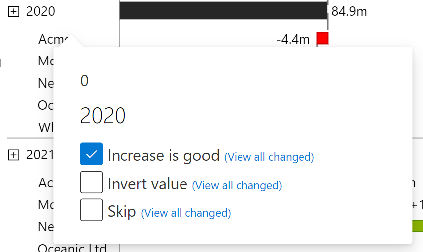
While in edit mode, click on a category label to access further options for that specific category or member. You will see three checkboxes that allow you to modify the treatment of the member:
The options available after clicking 2020
1. **Increase is Good:**
* **Default Setting:** This option is checked by default, meaning increases in this category will be shown in green, indicating positive impact.
* **When Deselected:** If you deselect this option, increases will be shown in red (negative impact), and decreases in green (positive impact). This is particularly useful for cost categories, where an increase typically represents a negative business outcome.
2. **Invert Value:**
* **Default Setting:** This option is unchecked by default.
* **When Selected:** Selecting this option will invert all values associated with this member, including its child elements, ensuring a valid breakdown of the chart. This is useful when costs are entered as positive values but need to be displayed as negative for accurate representation.
3. **Skip:**
* **Default Setting:** This option is unchecked by default.
* **When Selected:** This option will exclude the selected value from the waterfall chart calculations, effectively ignoring it in the breakdown.
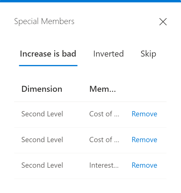
**Overview Window**
Next to each checkbox, there is a link labeled "View all changed." Clicking this link opens a window that provides an overview of all members with special treatments applied. From this window, you can manage and remove these special treatments as needed.
Keep an overview of the special members
#### Practical Example
Imagine you are working on an income statement and you have costs recorded as positive values. By using the "Invert Value" option, you can ensure these costs are displayed correctly as negative values, providing a more accurate representation of your financial data.
{% hint style="success" %}
There is an option in the Properties Pane under "Formatting" that inverts all Red/Green colors, in case this applies to all data displayed.
{% endhint %}
# Label Formatting
How to change number formatting of element labels
### Automatic Formatting
By default, the element number labels in Innofalls are formatted automatically and are oriented to the recommendations of the International Business Communication Standards (IBCS; see for details).
For each level (main and history levels) the order of magnitude of the values is determined individually and the corresponding numerical abbreviation is selected. The chosen abbreviation is used for the whole level. The abbreviations are:
* k for thousand
* m for million
* b for billion
We try to represent the numbers with a maximum of 3 digits. When smaller numbers than the order of magnitude exists, the number of decimals is increased.
### Manual Formatting
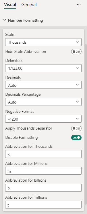
If you need more control over the number formatting, you can customize various aspects. The settings can be found on the property pane:
Number Formatting Settings
#### Scale
Controls how the numbers are scaled, with these options: *Auto*, *Trillions*, *Billions*, *Millions*, *Thousand* or *None*.\
Auto is the default setting, determining the order of magnitude automatically. *None* does not apply any scaling.\
*Note, that this can lead to a lot of decimals, if many drill down levels are present and aggregates have to be made.*
#### Hide Scale Abbreviations
When this is enabled, the numbers are scaled according to *Scale*, but the abbreviations are omitted. You may use this, if you want to show a fixed scale in the title, as proposed by the IBCS.
#### Delimiters
Lets you choose between *decimal comma* (e.g. 10.000,00) and *decimal period* (e.g. 10,000.00) and the corresponding digit group separator.
#### Decimals
The number of decimals to display. Choices are: *Auto*, *3*, *2*, *1*, *0* and *All*.
#### Decimals Percentage
The same as above, but for percentage numbers.
#### Negative Format
Whether to show negative numbers with a *minus sign* (e.g. -100) or put them in *parenthesis (e.g*. (100) )
#### Apply Thousands Separator
By default, the thousands separator isn't applied. You can change this by enabling this option.
#### Disable Formatting
Disable formatting completely. Takes the raw numbers provided by Power BI.
### Abbreviations
With the following properties you can change the suffixes when the numbers are scaled. Use this when you need the abbreviations in other languages or want to add a unit. E.g. use *mEUR* as an abbreviation for millions if you want to display *Euros in millions*.
#### Abbreviation for Thousands
By default: k
#### Abbreviation for Millions
By default: m
#### Abbreviation for Billions
By default: b
#### Abbreviation for Trillions
By default: t
# Scenarios
Scenarios are a way to indicate the viewer what kind of data the elements in a chart or table represent. The International Business Communication Standards (IBCS) propose the usage of the following four scenarios (or data types; see ):
| Short | Name | Format Example |
| ---------- | ---------------- | ---------------------------------------------------------------------------------------------------------------------------------------------------------------------------------------------------- |
| AC | Actual |  |
| PP | Previous Period |  |
| PL (or BU) | Plan (or Budget) |  |
| FC | Forecast |  |
To visualize a series formatted as a scenario, you have to let the name of the measure end with the abbreviation. These are examples:


You can rename the measures for each visual individually:

# Themes
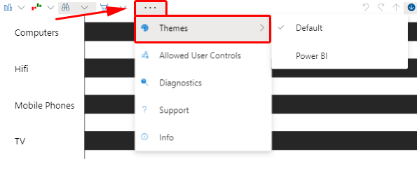
Right now you have the choice between two color themes for the Innofalls visual. You can change the selected theme in the property pane or here:
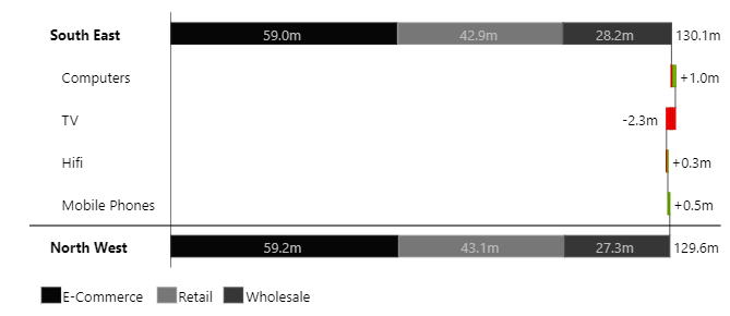
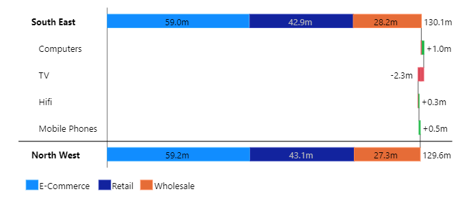
The themes are:
* **Default Theme**: The colors are based on the recommendations of the Internation Communication Standards IBCS)
* **Power BI Theme**: The colors from the Power BI palette are used. If you change the Power BI palette, the colors in the visual change as well
Default Theme
Power BI Theme
# Colors
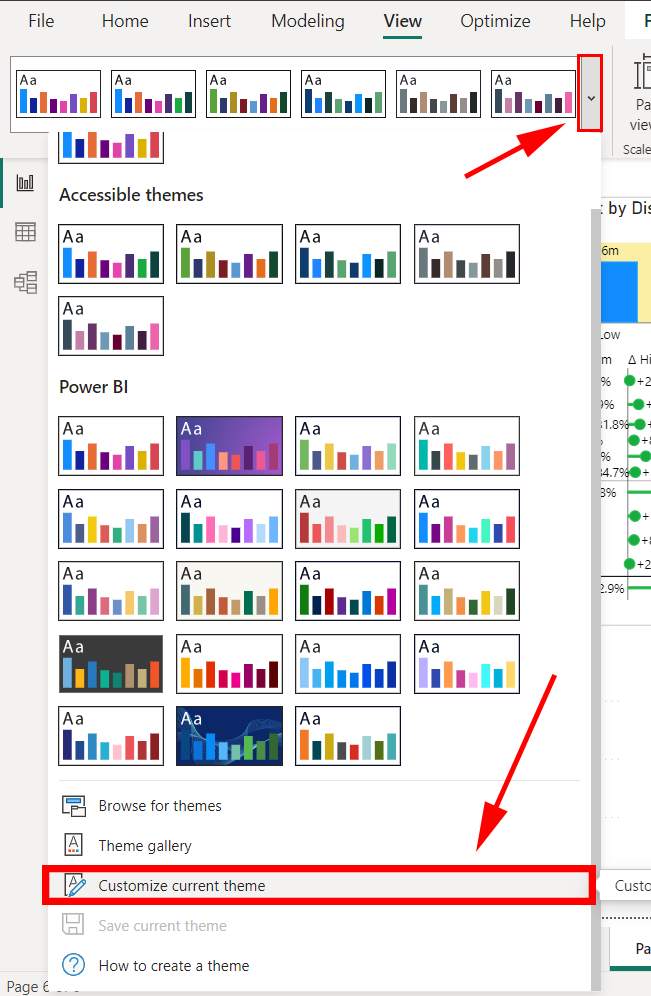
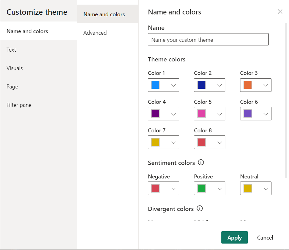
To change the colors in an Innofalls visual, you currently have to select the Power BI theme and change the colors inside Power BI. All changes to the theme are automatically applied to the Innofalls visual.
You can customize the theme settings in Power BI on the **View** ribbon. Then open the theme selection and click **Customize current theme**.
Power BI Themes
Opening Theme Customization
A window opens, which lets you customize all colors.
# Conditional Formatting
Conditional formatting in Innofalls charts allows users to dynamically adjust their charts based on specific data conditions. By applying visual effects such as color changes, bold text, and more, users can highlight key data points and customize their charts to meet specific needs. This section covers the available conditions and effects, providing examples of when and why to use them, and demonstrates a practical use case.
### Why and When to Use Conditional Formatting
Conditional formatting is useful for emphasizing important data, identifying trends, and making comparisons clearer. You can use it in various scenarios, such as:
* Highlighting values that exceed a certain threshold
* Hiding Labels of Small Elements
* Consistently colorizing measures across charts
* Reformat Sums
* Adding scenario formatting to specific dates
### How Conditional Formatting is Set Up
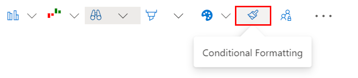
To open the conditional formatting dialog, click on the corresponding button in the menu:\\
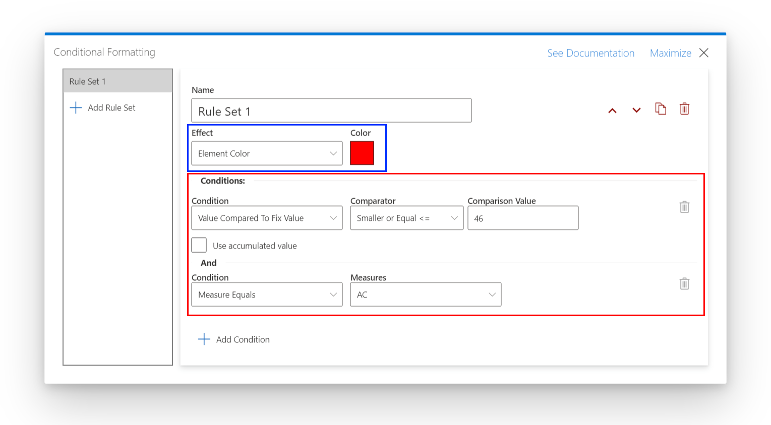
A large dialog is opened, which displays the list of rules on the left side and details for the selected rule on the right.
Conditional Formatting Dialog
The effect (blue box) is what is applied if all conditions (red box) below match. There has to be at least one condition and all of them have to match. There is no OR condition.
The following conditions and effects are available:
### Conditions
| Condition Type | Description | Parameters |
| ----------------------------------- | --------------------------------------------------------------------------------------------------------------------------------------- | ------------------------------------------------------------------------------------------------------------------------------------------------------------------------------------------------------------------------------------------------------------------------------------------------------------------------------------------------------------------------------------------------------------------------------------------------------------------------------------------------------------------------- |
| **Measure Equals** | Checks if the measure key matches specified measure keys | **Measure Key:** Select one or more measure keys. Any of them has to match. |
| **Member Equals** | Checks if the grouping member key matches specified member keys |
Dimension: Select a dimension from which the member(s) have to match Member: Any of the members has to match
|
| **Sum** | Checks if the data represents a sum | Sum- You can select if the Element has to be a sum, or if it must not be a sum |
| **Value Compares to Fix Value** | Compares the value to a specified value using a comparator |
Comparison Value: The value or threshold to compare with
Comparator: How the values are compared (e.g. smaller, greater, equal etc.)
Use accumulated value: Checks whether the accumulated value is above the threshold; important for waterfall values
|
| **Value Compares to Measure Value** | Compares the value to another measure's value |
Target Measure: Another measure in your data to compare with
Hint: When you combine this with Custom Chart Configurations, you can add measures to the chart that can be used for calculations but are not visible to the viewer.
Comparator: How the values are compared (e.g. smaller, greater, equal etc.)
Use accumulated value: Checks whether the accumulated value is above the threshold; important for waterfall values
|
| **Value Meets Measure Range** | Checks if a value is inside the range of another measures value. For example, you could check if your Sales are within 5% of your Plan. |
Target Measure: Another measure in your data to compare with
Range in percent: The amount the values are allowed to deviate.
Use accumulated value: Checks whether the accumulated value of the measure to test is above the threshold; important for waterfall values
Must be outside range: If checked, the condition applies when the value is outside and not inside the specified range.
|
### Effects
| Effect Type | Description | Parameters |
| ------------- | --------------------------------------- | ------------------------------------------- |
| Element Color | Changes the bar's fill and stroke color | Color |
| Frame Color | Changes the bar's stroke color | Color |
| Hide Text | Hides the text label | None |
| Bold Text | Makes the text label bold | None |
| Scenario | Changes the text color | A scenario from the list AC, PP, FC and BU. |
# Profit and Loss Statement
How to create a profit and loss statement with Innofalls
Waterfall charts, also known as bridge charts, are often used to visually represent changes and variances in financial data. They show how various factors contribute to the overall change between two periods. Waterfall charts are particularly helpful when presenting financial statements that involve multiple line items or categories, allowing viewers to see the net effect of positive and negative changes. By displaying each component as a sequential bar with upward or downward movements, waterfall charts provide a clear understanding of the drivers behind the change being reported.
In this example we have a look at how to create a "profit and loss" statement with Innofalls.
You can download this example here. If you open it with Power BI Desktop, you need no license.
{% file src="/files/RYtqLx3nIObI3gtnXjAA" %}
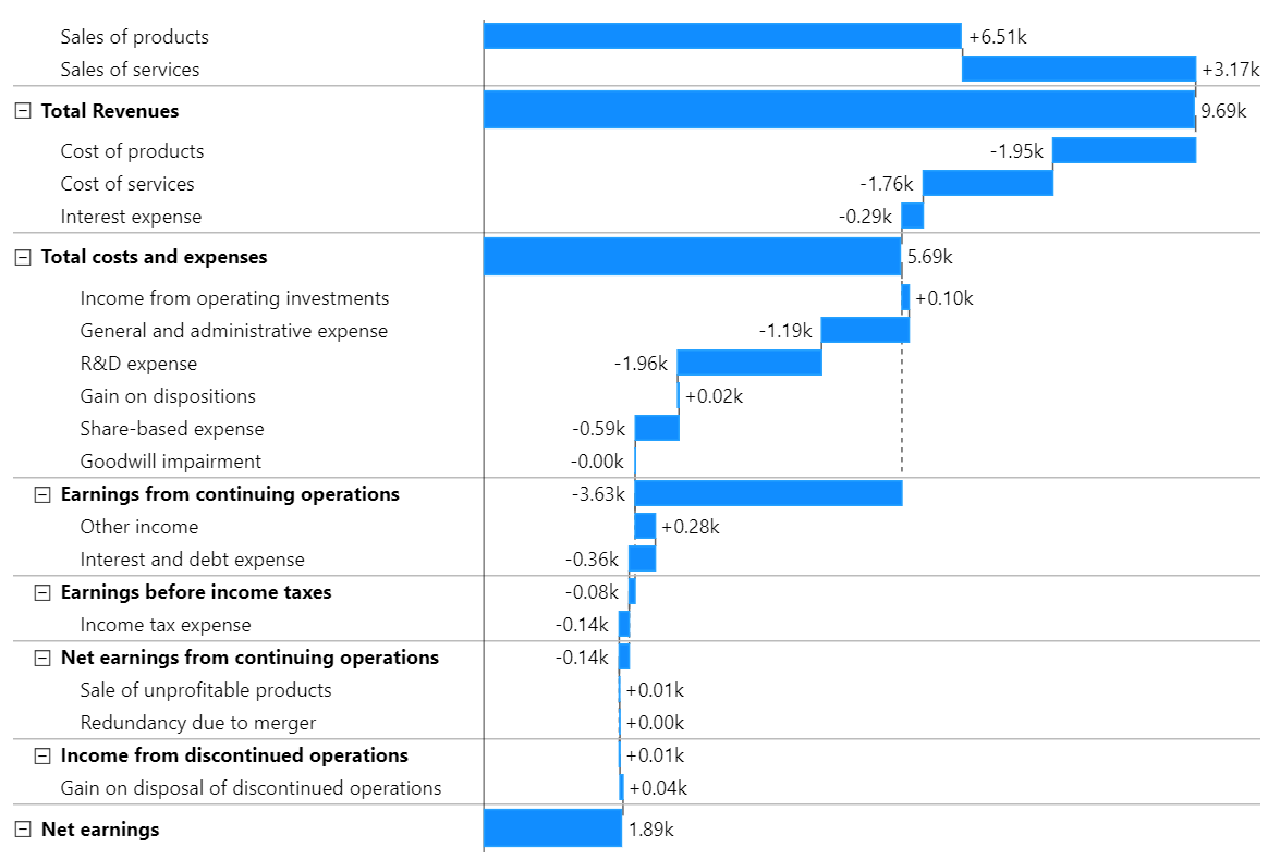
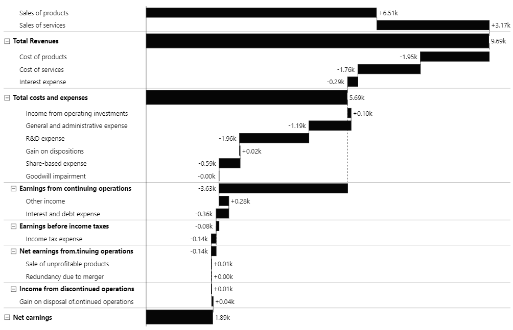
This is the chart we want to create:
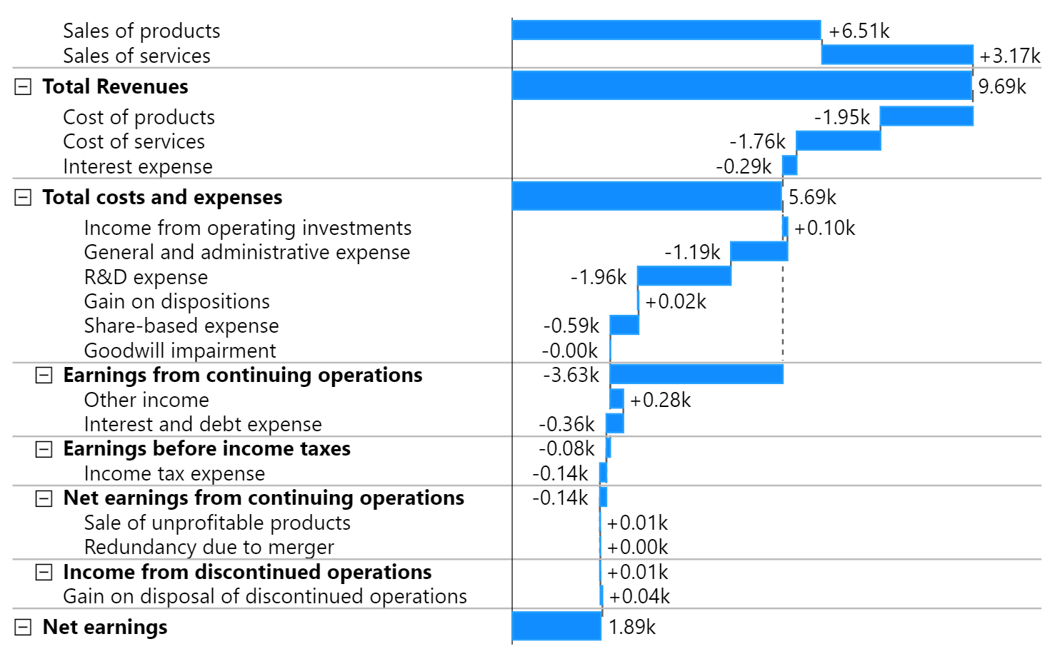
Final Profit and Loss Example
This is a *running totals waterfall* chart with *intermediate totals*. Intermediate totals means, that expanded nodes of the first level are summing up all previous values and are shown as a sum from zero. In this case *Total Revenues*, *Total costs and expenses* and *Net earnings.*
{% hint style="info" %}
In contrast, intermediate sub sums show expanded nodes as a summarizing change of all child nodes. See *Earnings from continuing operations* above as an example, which is on the second level.
{% endhint %}
## How the Chart is Made Up
The chart is created with default settings. No configuration has to be made.

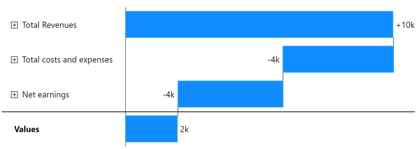
Before we get into how the data for this example is structured, we examine the chart with collapsed nodes to understand how it is build up. When all nodes are collapsed, we get the following chart:
### First Level
When everything is collapsed we have three nodes and a sum:
* Total Revenues (as the start sum)
* Total costs and expenses (as a change)
* Net earnings (as a change)
* Values (as the overall sum)
These values come from our **top level dimension**. All detailing data is hidden under these parent nodes and can be made visible by expanding these nodes. You can identify nodes that can be expanded by the little "plus" icon next to their category label.
Further you will notice that the two nodes in the middle are shown differently than in the example above - not as sums. To create a valid waterfall chart, the nodes in between are shown as *changes* and the result is added as a final sum.
### Second Level
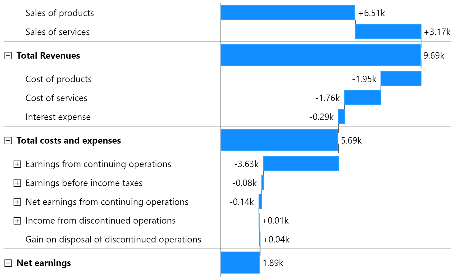
Open the nodes by clicking the "plus" icon next. As soon as we open the three nodes, we get the following:
Now we see the **second level dimension**. *Net earnings* has become our final result and *Values* has been removed. If the last element in a running totals waterfall chart is expanded, it becomes the resulting value.
We are observing that our data is unbalanced. What this means is that some parent nodes have additional child nodes that can be expanded further, while other parent nodes only have the final or end nodes (also called leaf nodes) without any further subcategories.
{% hint style="info" %}
Innofalls supports unbalanced hierarchies of arbitrary structure and depth.
{% endhint %}
### Third Level
When we finally expand all remaining closed nodes we get our full example from the beginning. All remaining nodes are part of our **third level dimension**.
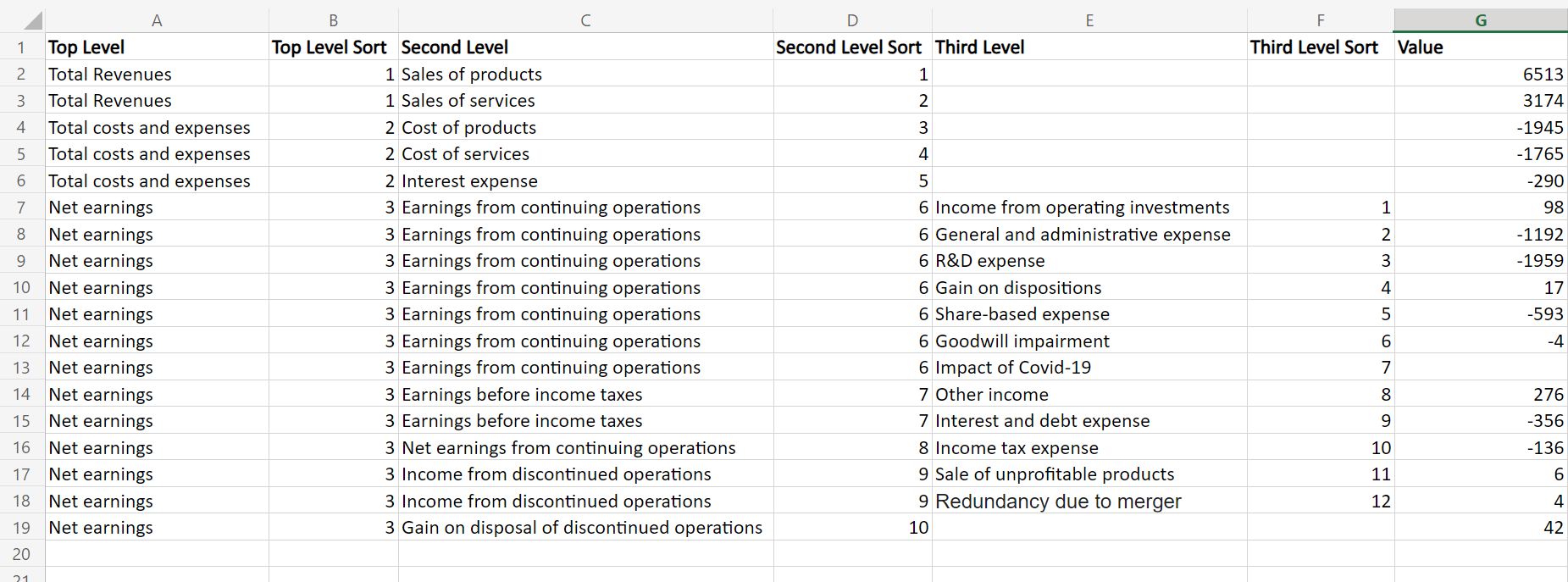
## The Data
The data behind this chart made up of **three dimensions**, each representing a level of our hierarchy:
* Top level
* Second level
* Third level
Our **Values** are in a single column.
This is the Excel sheet for our chart:
There are some important things to notice:
#### **Sums Are Generated Automatically**
The values are only present for the final nodes (or leafs). The sums for the *Top Level* and *Second Level* nodes are calculated automatically.
#### **Some Rows Are Empty on the Third Level**
If a row contains no value for *Third Level*, the value is assigned to the above level. This way we define different depths in the hierarchy.
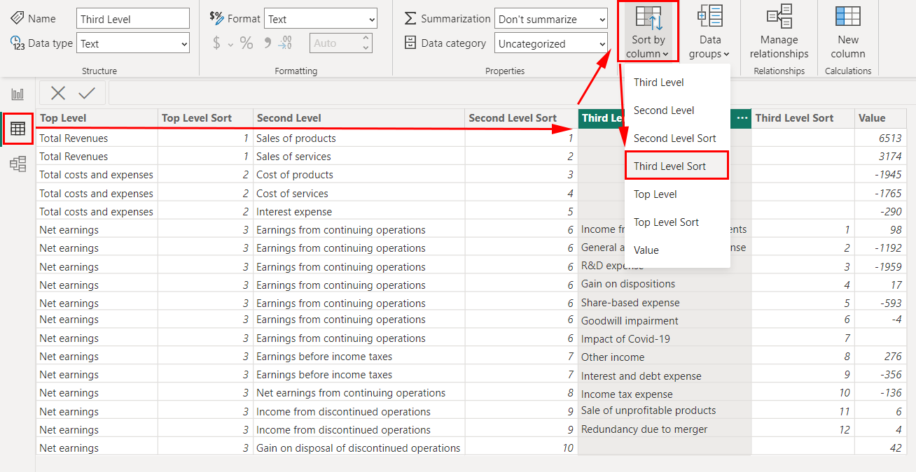
#### **Sort Columns**
To ensure the order of the nodes stays as we intended and prevent Power BI from resorting them in random order, we define a *sort column* for each *level column* and apply this order in the *Data View* in Power BI:
Sorting the third level
### Adding the data into the data fields
Now we import this data into Power BI and add the dimensions and values to an Innofalls chart in the following way.

After adding this data and expanding all closed nodes we are done. We don't have to configure anything. You might consider choosing the *IBCS-Colors* theme if you prefer the following look:
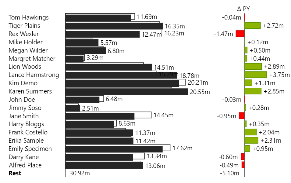
# IBCS Styled Bar Chart with Deviations
The [International Business Communication Standards](https://www.ibcs.com/de/) (IBCS) are a set of recommendations for making reports consistent and understandable. Part of these recommendations introduce the usage of [scenarios](https://docs.innofalls.com/formatting/scenarios), which are defined types of element formatting (color and fill) indicating what kind of data type they represent. Together with the usage of deviations these charts have a very distinctive look - clear and easy to read, especially when you are used to this kind of formatting.
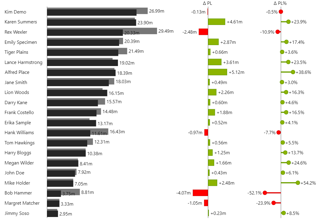
In this example we look at how to create a chart following these guidelines. The result will be this:
You can download this example here. If you open it with Power BI Desktop, you need no license.
{% file src="/files/1U6wWm8pnN3aFRq5ju9K" %}
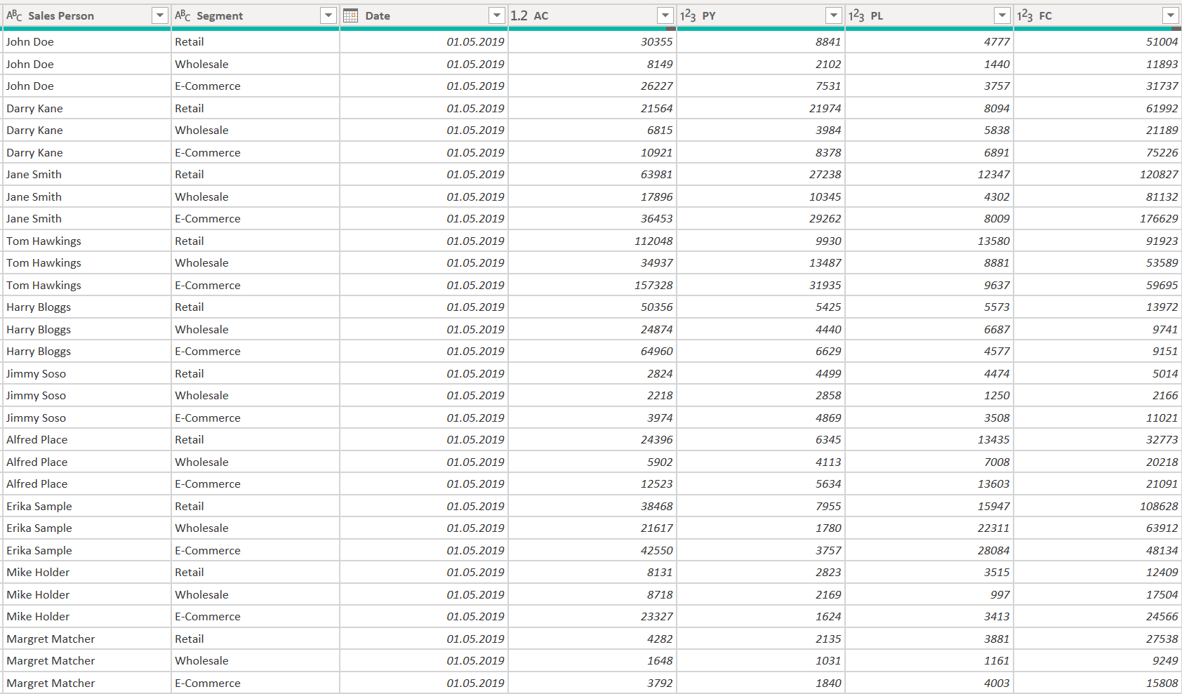
For this example we need data that contains the scenario values as columns (or measures). To build this chart we rely on three measures:
* AC as our **Ac**tual,
* PP as the **P**revious **P**eriod and
* PL as our **Pl**an
To name the measures exactly this way is important, as you will see down below.
The dataset looks like this:
We are using the **Sales Person** as our row dimension, but it could be any other as well.
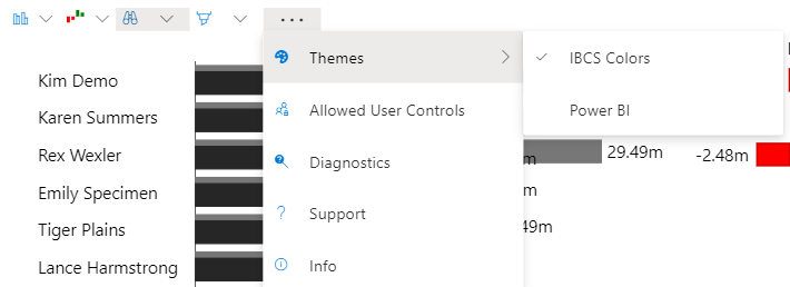
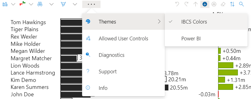
To get started with building this chart we need to select the theme *IBCS Colors* from the menu or the property pane.
{% hint style="info" %}
Currently, *IBCS Colors* is the default theme. From the upcoming update on (version 1.1, estimated release August 2023) the default theme will be *Power BI*. Furthermore from version 1.1 on *scenarios* will be applied *only* when selecting the *IBCS Colors* theme.
{% endhint %}
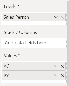
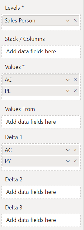
Now we add the values into the data fields. First we add our *Sales Person* into *Levels*. This will be our rows. We want to visualize AC and PP in the bar chart, so we add these into *Values:*
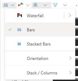
By default Innofalls shows our data as a waterfall chart. To change this into bars we select this in the menu:
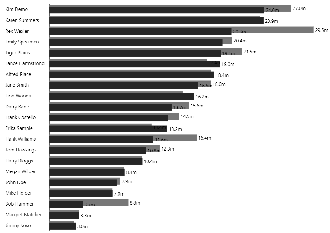
This leads to an already formatted result:
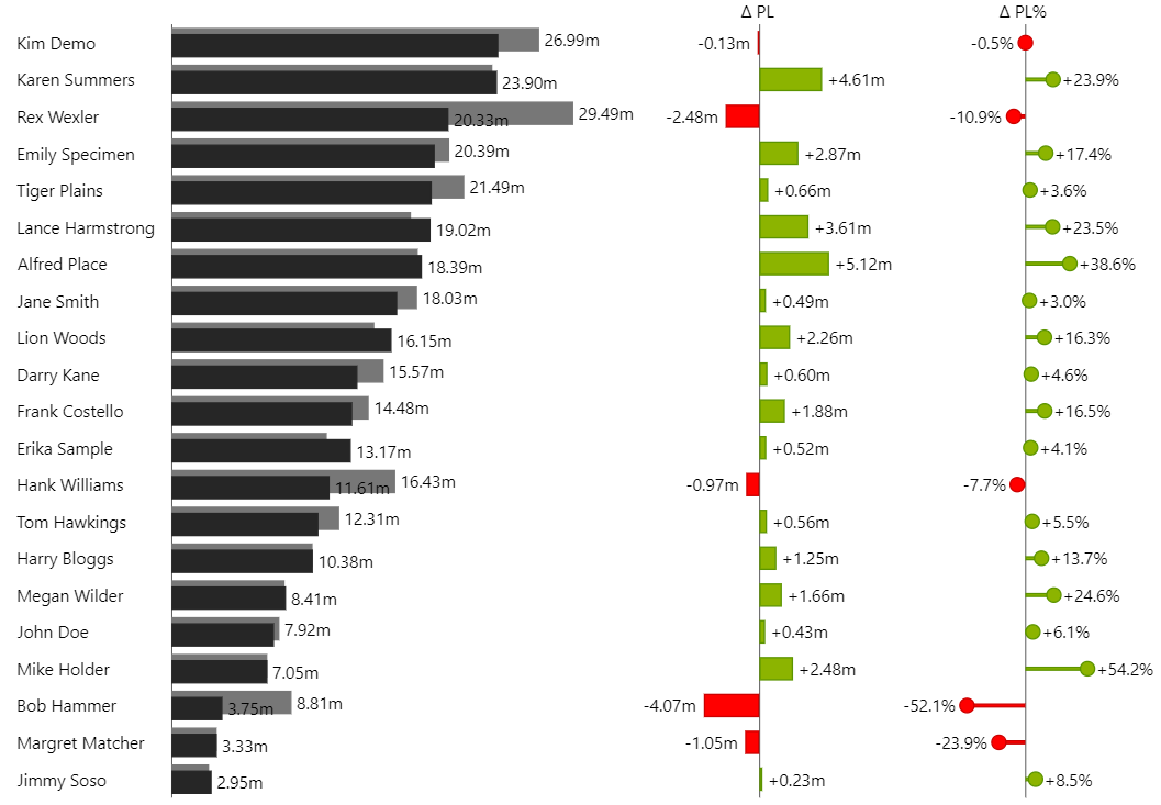
As you can see, the formatting for AC (black) and PP (grey) have already been applied. This is because Innofalls recognized from the name of the measure that it is a scenario. ([See here for more details.](https://docs.innofalls.com/formatting/scenarios))
To finish this example, we now add the deviation charts. We want the deviation calculated between AC and PL. As well as an absolute deviation and a percentage deviation. We do this by adding AC and PL twice into the delta fields 1 and 2. Each delta field expects exactly two measures and represents one deviation chart. The deviation is calculated between the two measures filled in.
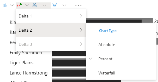
Two identical deviation charts appear next to our base chart. To show the second of these as a percent deviation chart, we need to select *Percent* as the chart type for *Delta 2* in the menu:
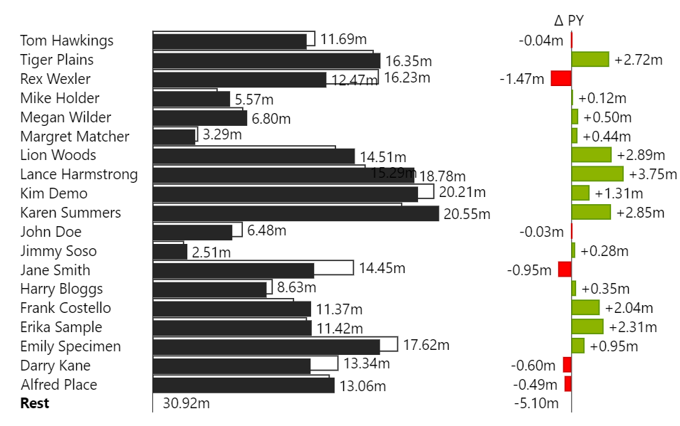
Now we already look at our final result:
Note that you can sort by the values of the deviation charts by clicking the labels on top of them. This allows to identify quickly which entities performed best or worst. *(The sorting feature is part of our upcoming release.)*
# Quick Examples
We collected some quick examples and how to create them. The examples include how to fill the data fields and which steps you have to take to reproduce the example.
Most of the examples have been created with the sample dataset provided by Power BI. All examples that include **scenarios** are based on the **Sales Persons** dataset, which you can download here:
{% file src="/files/4CPjnkOlMFyhXQjUEwPs" %}
# Waterfalls in Columns
## Chart Result
## Data Fields
*This example was created with the sample dataset provided by Power BI.*

## Steps to reproduce
To display the countries as columns, **Columns by Dimensions** must be selected.

# Products Stacked by Segments
## Chart Result
## Data Fields
*This example was created with the sample dataset provided by Power BI.*

## Steps to reproduce
**Stacked Bars** as the chart type

# Comparing Quarters
Comparing by utilizing the Drill Down History
## Chart Result
## Data Fields
*This example was created with the sample dataset provided by Power BI.*

## Steps to reproduce
1. Drill down into **Quarter 3**

2. Hover over **Quarter 2**, then click the **toggle deviation button**

3. Hide **Drill Down History** by clicking the according button in the menu

# Comparing Measures
Adding deviation charts between measures
## Chart Result
## Data Fields
*This example was created with the sample dataset provided by Power BI.*

## Steps to Reproduce
1. Selecting **Bar Chart** as the chart type
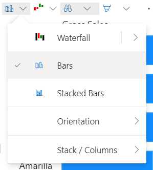
2. Selecting deviation type **Percent** for the **Delta 2** deviation chart

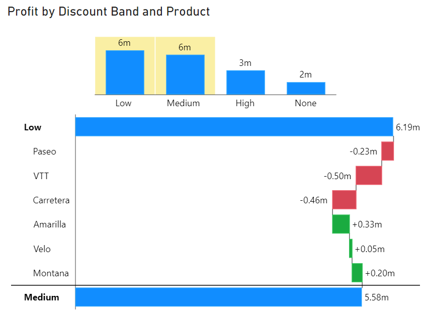
# Delta Waterfall by Drill Down Combination
## Chart Result
## Data Fields
*This example was created with the sample dataset provided by Power BI.*

## Steps to reproduce
1. Drill down into **Medium**

2. Select **Low** while holding down the **CTRL key** for multi selection

{% hint style="info" %}
When two or more elements in the drill down history are selected and waterfall scheme is set to **Auto**, a delta waterfall will be displayed automatically.
{% endhint %}
# IBCS Bar Chart
A bar chart with IBCS scenarios
## Chart Result
## Data Fields
*This example was created with the* [*Sales Persons*](/examples/quick-examples) *data set.*
## Steps to Reproduce
1. Selecting **Bar Chart** as the chart type
2. Select **IBCS Colors** theme
{% hint style="info" %}
The scenario formatting is automatically derived from the name of the measures: **AC** and **PL.** [Read more about scenarios.](/formatting/scenarios)
{% endhint %}
{% hint style="info" %}
**Rest** is automatically created when the chart is too small.
{% endhint %}
# Trial License
If you are trying our software and need to test deployment on the Power BI Service, you can request a trial license here:
The trial license allows you to test our software in any environment without limitations.
It is valid for 30 days.
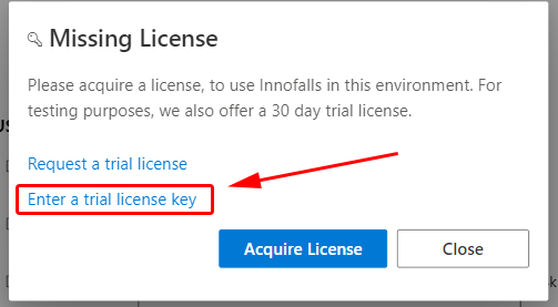
You can enter the trial license either in the dialog letting you know that you are missing a license
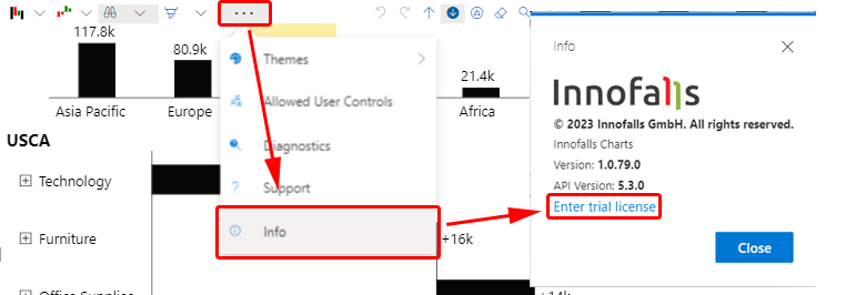
or you can enter it from the info dialog, accessible from the menu.
When entering the license while using *Power BI Service*, please make sure to enter **edit mode** first. Otherwise the license won't be saved.
*Note: Right now, you need to enter the trial license for each visual individually. This is a temporary limitation from Power BI, but will be available in future releases. Please excuse this inconvenience.*
# Paid Licenses
To use Innofalls in production elsewhere than Power BI Desktop, you need to purchase a license for every user viewing a report with an Innofalls visual.
Please refer to our pricing to get more details:
You can purchase those licenses directly on the offer page of our visual in Microsoft AppSource. The licenses are assigned in your *Office Admin Area*.
# Assign Paid Licenses
To use purchased licenses, you must manually assign them to individual users or groups. A license must be assigned to each user who should be able to use Innofalls Charts in Power BI Service.
Licenses can be reassigned manually anytime. So in case a user doesn't need a license anymore and you want to assign this license to another user, you can do so.
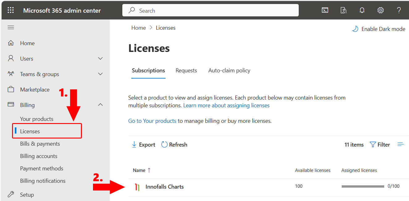
To assign the licenses to the users, you must call up the Microsoft administration portal and open the *licenses* area.
{% embed url="" %}
1. In the licenses section you can see your purchased licenses for Innofalls Charts.
2. Select your licenses for Innofalls Charts
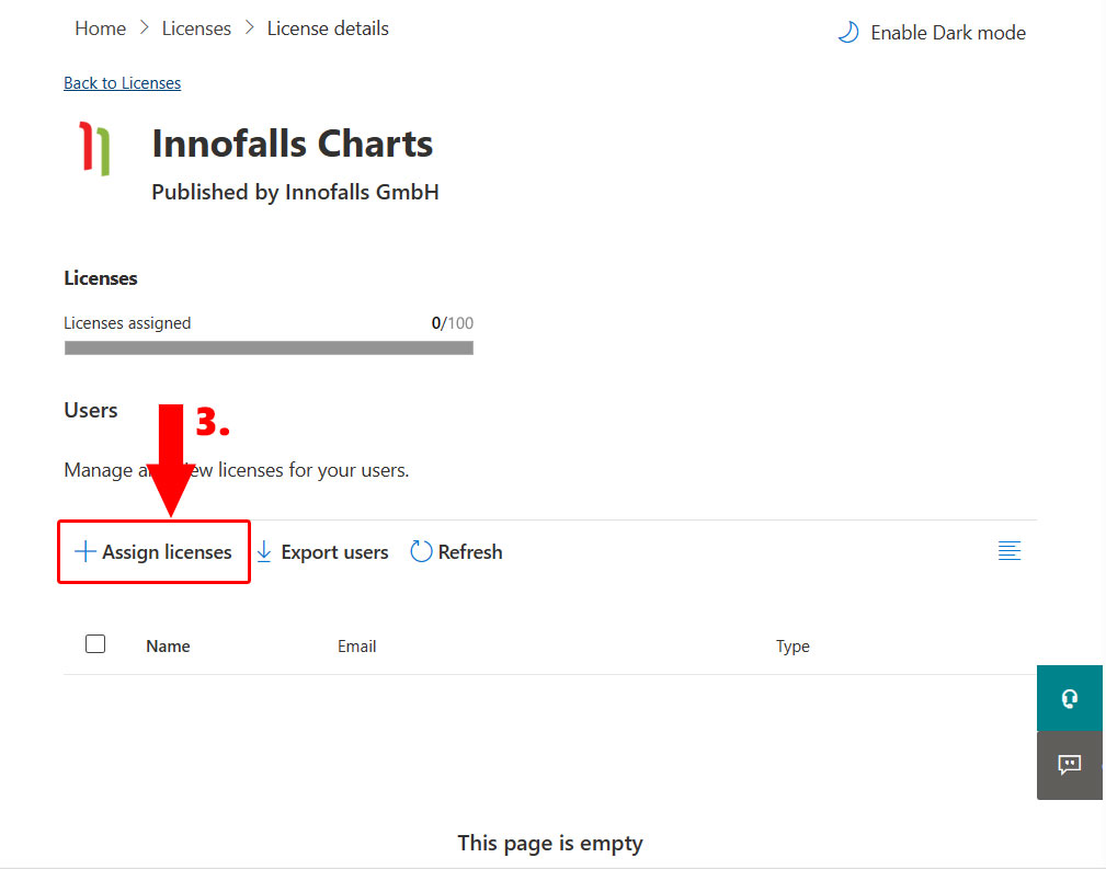
You will receive an overview of how many licenses have already been assigned.
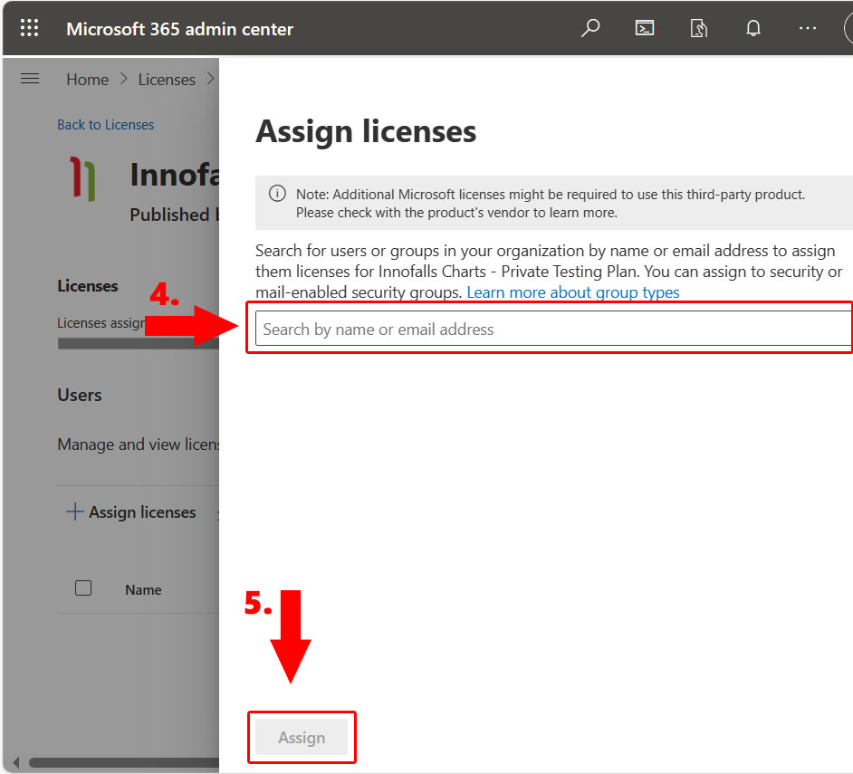
3. Select *Assign licenses* to assign licenses to users.
4. In the search field, you can either search for users to assign licenses individually or you can search for groups to assign licenses to entire groups in batches - provided you have enough licenses.
5. Click on *Assign* to assign these licenses. Please wait a few minutes for the assignment to take effect.
Further FAQ can be found on the Microsoft Learn pages:
# Free License
Innofalls can be used for free without any limitations in *Power BI Desktop*.
If you wish to use it in any other environment like Power BI Service, you need to acquire a license. Alternatively, you can request a [Trial License](/licenses/trial-license) for testing purposes.
# Publishing to the Web
When you wish to publish your report with Innofalls to the web, please be aware of the following:
If you have purchased a license, it cannot be verified in published reports for technical reasons. To enable the visual in this environment, you need to apply a trial license.
If you have purchased Innofalls and wish to publish to the web, please contact us at to get a long term license.
# Data Security Overview
This article details how Innofalls for Power BI ensures data security and efficient processing. It covers the certification process, encryption methods, hosting details, access control, and support procedures. Additionally, it explains the handling of the visual in Power BI Desktop. You will understand how your data is protected and managed with Innofalls.
#### Frequently Asked Questions
Is data temporarily stored somewhere?
No, Innofalls does not store any data by itself. All data is processed within Power BI.
How is data encrypted?
Data is encrypted in transit and at rest using industry-standard encryption protocols provided by Power BI.
Where is the application installed?
Innofalls is a cloud-based solution, hosted on Microsoft’s secure Azure cloud infrastructure. For EU customers, data is hosted within the EU region unless specified otherwise.
By whom is this data visible?
Access to data is strictly controlled. Only users with appropriate permissions within your Power BI environment can access the data. Innofalls staff do not have access to your data.
**Certified Power BI Visuals and Data Safety**
Certified Power BI visuals like Innofalls undergo a stringent certification process by Microsoft to meet high security and quality standards. This includes code reviews, static code analysis, data leakage checks, penetration testing, and input validation. These measures ensure the visual does not access external services or resources, maintaining data integrity within Power BI.
[Read more](https://learn.microsoft.com/en-us/power-bi/developer/visuals/power-bi-custom-visuals-faq)
**Data Processing and Storage**
Innofalls does not store any data by itself. All data used by the visual is processed within the Power BI environment. The visual interacts with Power BI through a Visuals API, which provides the necessary data and context. The data is only rendered on the screen within Power BI, ensuring it stays within the secure boundaries of the Power BI ecosystem.
**Encryption and Data Security**
Power BI handles data security in transit, using robust encryption methods to protect data as it moves between clients and servers. Power BI employs industry-standard encryption protocols, ensuring that data is encrypted both in transit and at rest within its services. Additionally, Microsoft’s cloud services comply with a broad set of international and industry-specific compliance standards, such as GDPR and ISO/IEC 27001, to ensure data protection and privacy.
**Installation and Hosting**
Innofalls is a cloud-based solution, hosted within Microsoft’s secure Azure cloud infrastructure. Microsoft is responsible for hosting the visual, and Innofalls is not involved in this aspect. For EU customers, data residency and compliance with local regulations are maintained, ensuring that data is hosted within the EU region unless otherwise specified by the customer.
**Data Access Control**
Access to data in Innofalls is strictly controlled. Only users with the appropriate permissions within Power BI can access the data. Innofalls staff do not have access to your data, as the visual operates entirely within Power BI reports without external data transmission. The visual’s access control and row-level security function identically to core Power BI visuals, ensuring consistent data permissions and security measures.
**Support and Data Handling**
In the event of support issues, customers have the option to manually extract support information from the visual to share with the Innofalls support team. This support information includes all the necessary details to replicate the chart in its current state, such as the associated data, configuration settings, and filter states. Importantly, any data provided through this process is safeguarded by the confidentiality provisions specified in the license agreement. This manual provision is the exclusive method by which Innofalls can access data from the visual; no other means of access exists.
**Power BI Desktop Usage**
When using Power BI Desktop, the Innofalls visual, even when installed locally, still operates under the same restrictions and security measures as in the Power BI service. The processing on a local machine is fully managed by Power BI. There is an option to install the visual from a local file, which is primarily intended for development, debugging, or use on offline computers. However, for typical usage of Innofalls, installing from the cloud is sufficient and recommended to ensure the latest updates and security features are applied.
For further assistance or additional questions, please contact our support team. We are committed to ensuring you have a secure and efficient experience with Innofalls.
# Change Log
#### Version 1.2.4
```
Conditional formatting
Custom chart configuration
Multi row category labels
Improved legend colors
Highlight menu and percent deviation highlights
Font color added
Legend can now be deactivated
Option to display expanded sums as text or not
Inset of category labels adjustable
Preview level calculations choosable (relative or absolute)
Meausures can be displayed without levels
```
{% hint style="info" %}
*Some highlights might be lost from version 1.1.39 to 1.2.4, due to the addition of the percentage deviation option.*
{% endhint %}
#### Version 1.1.39
```
Added element label formatting
Publish to web supported (License key required)
Bug fix for percent deviation in sums
Bug fix for sorting on expanded level
```
#### Version 1.1
```
Added sorting and top/bottom N
Automatic rest depending on visual size
Improved responsiveness
Improved layouting
New column modes (by measure, by dimension, by both)
New properties in property pane
Drill down filtering
Power BI theme is now selected by default
```
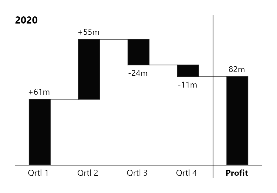
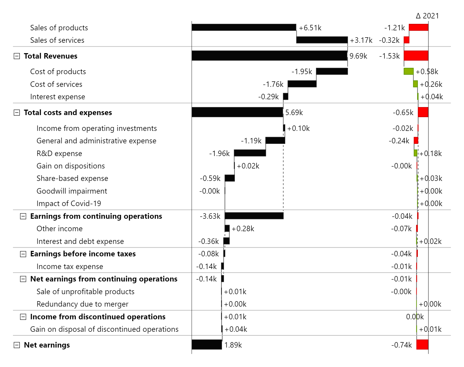

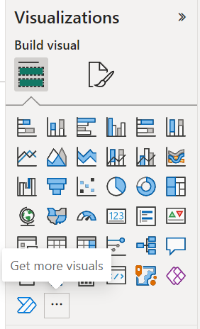 Search for "Innofalls" and open the product page. By clicking the "Add" button, you add the Innofalls visual to your report.
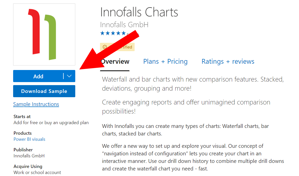
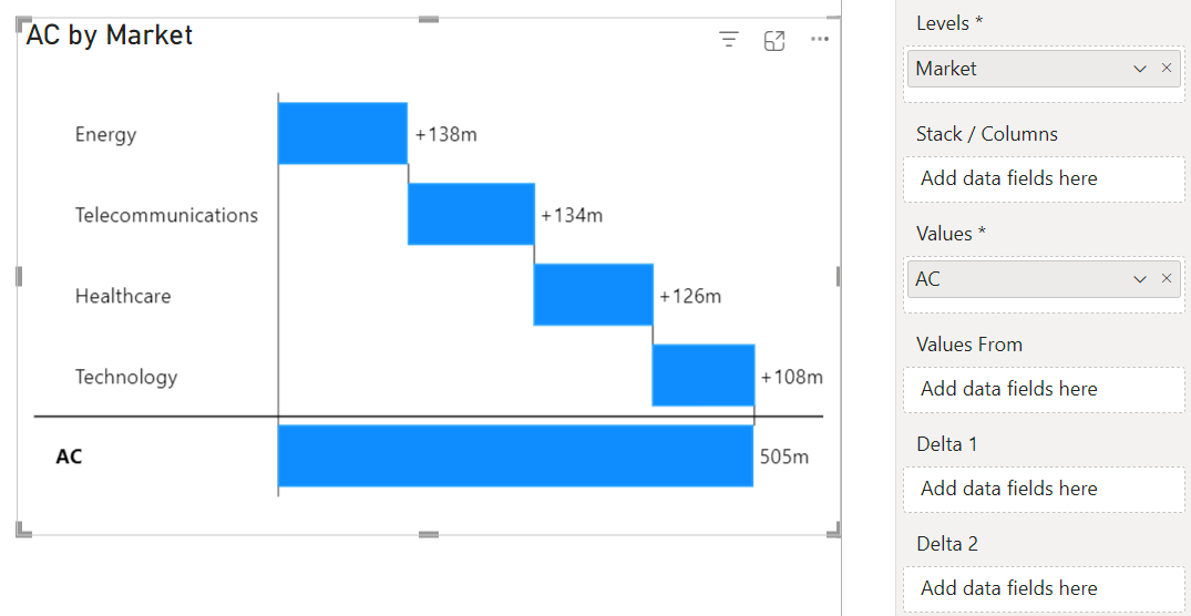
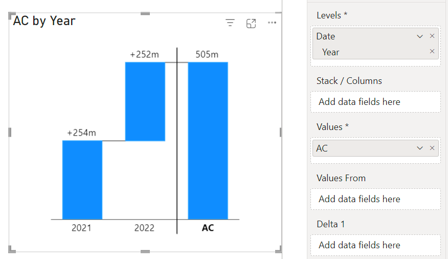
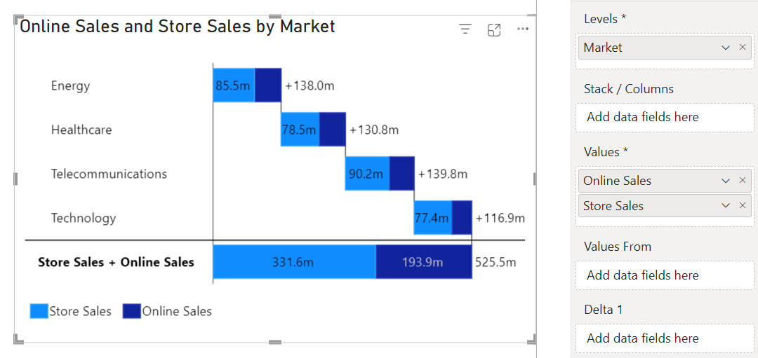
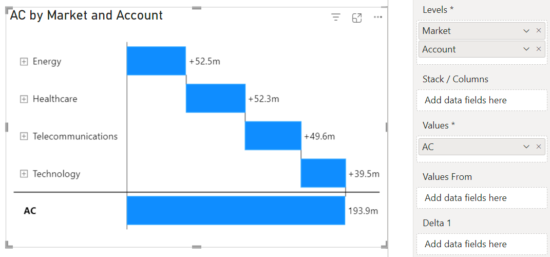
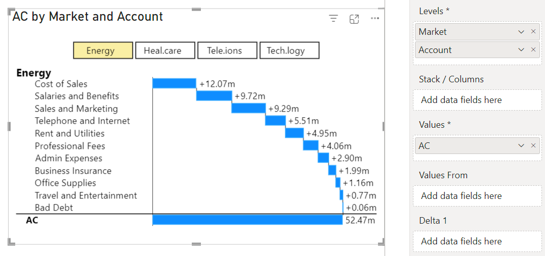
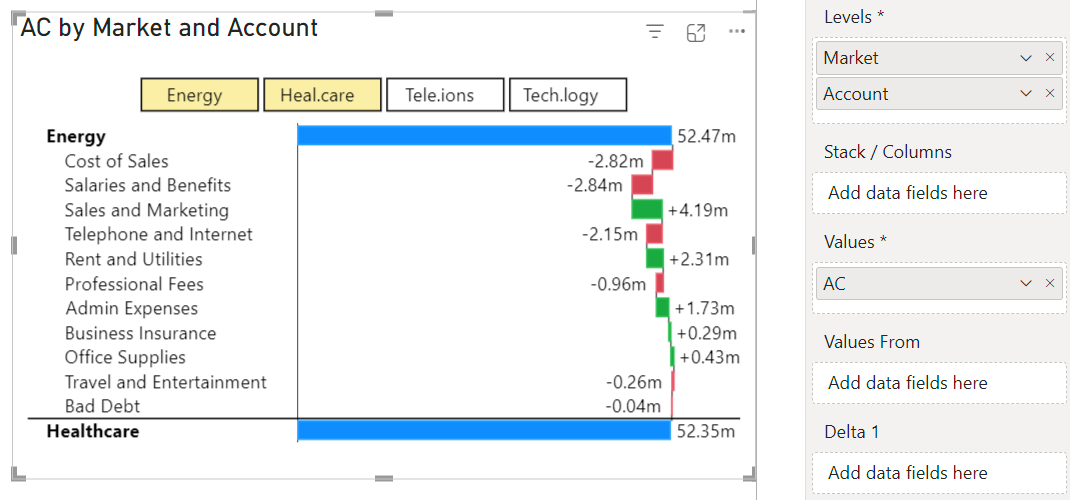
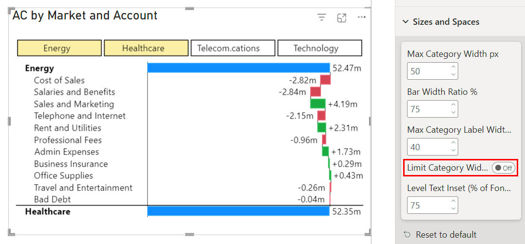
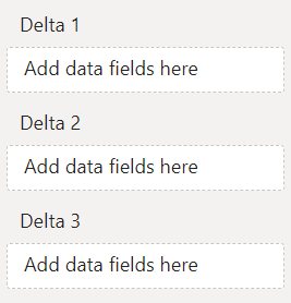
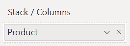 Each element of the chart is then split into multiple segments. The basic bar chart creates multiple series from the stacking dimension.
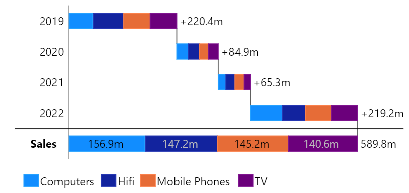
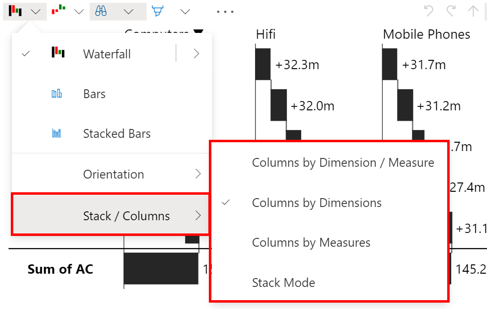
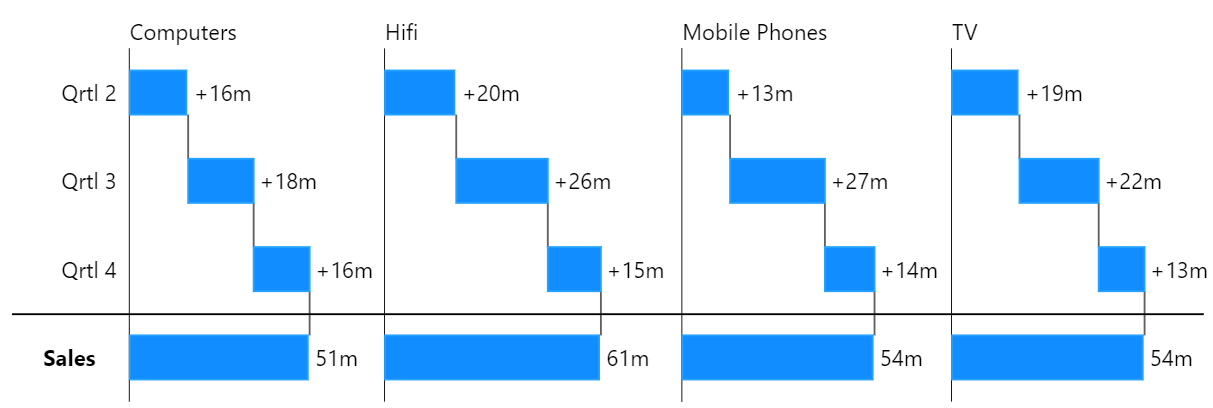
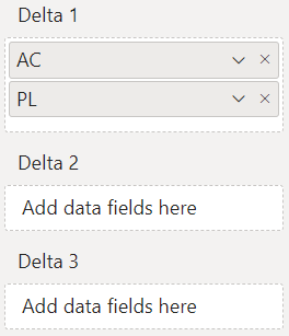





 symbol next to the category label.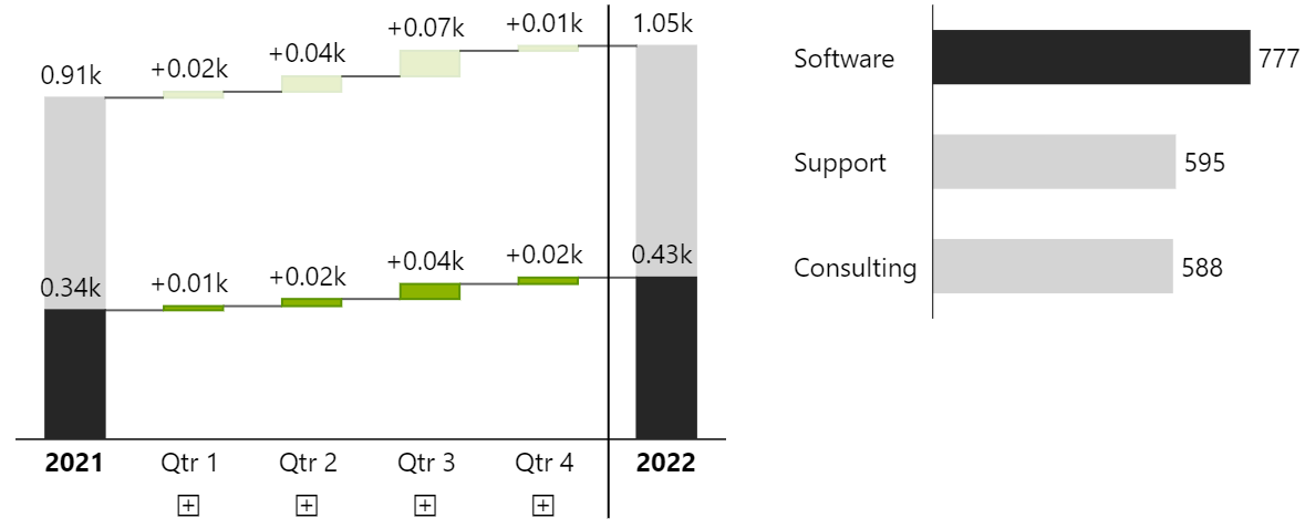
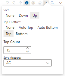
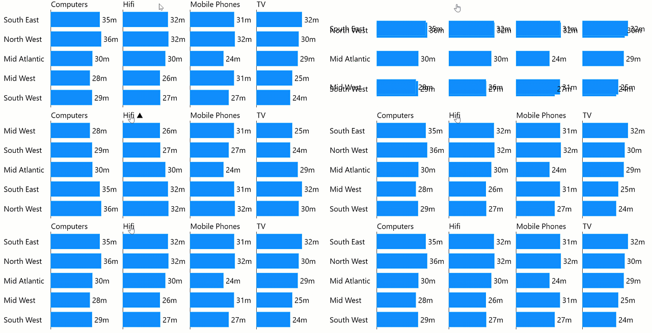
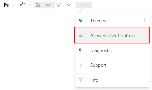
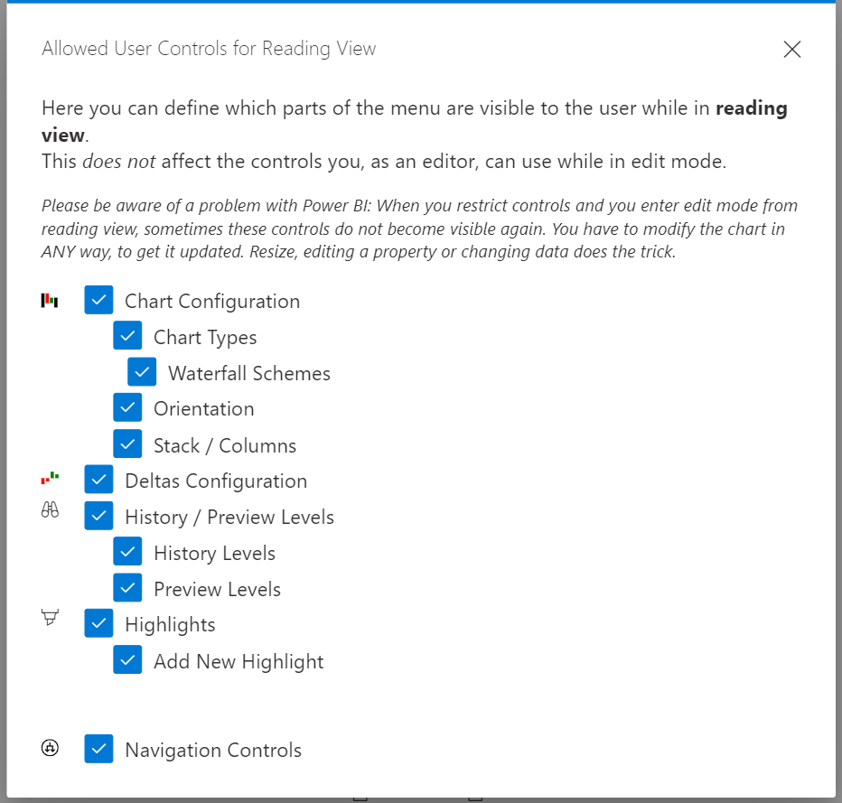
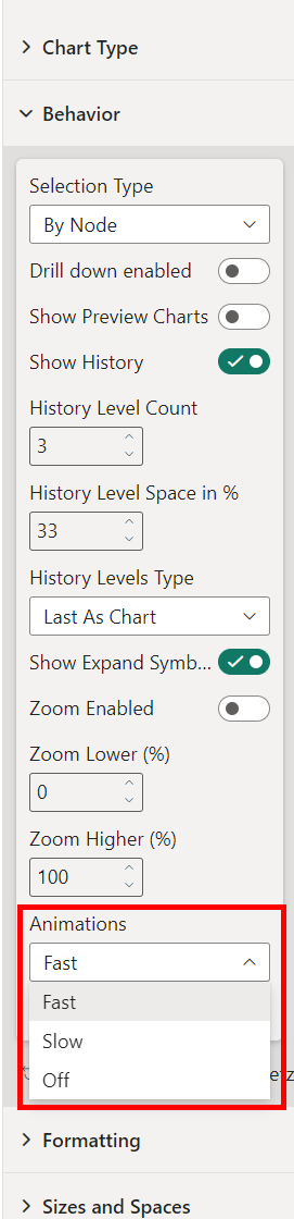
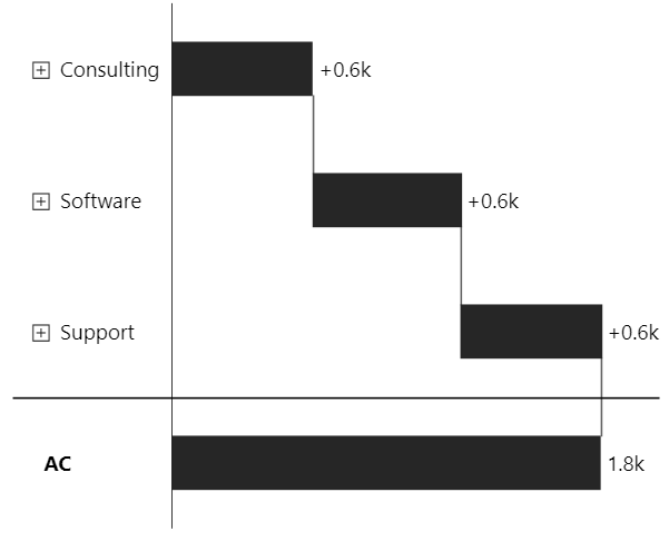
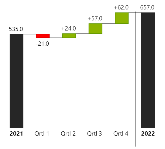
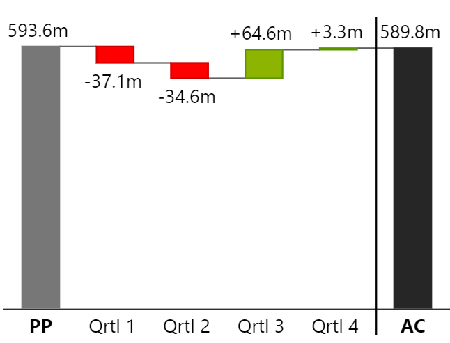
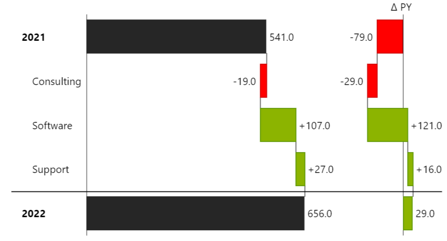
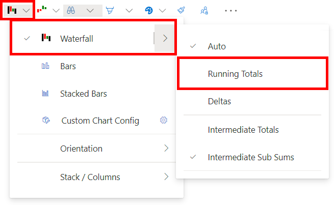 {% endhint %}
## **Example Use Cases:**
{% endhint %}
## **Example Use Cases:**
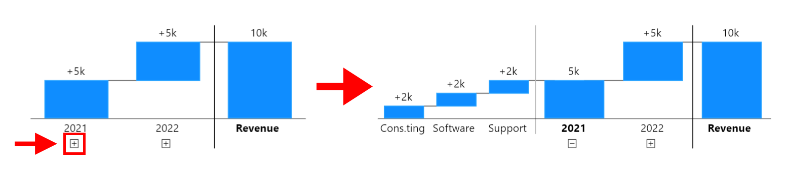
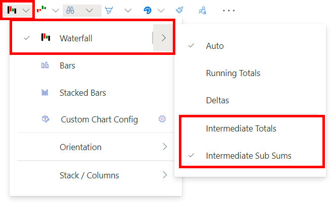
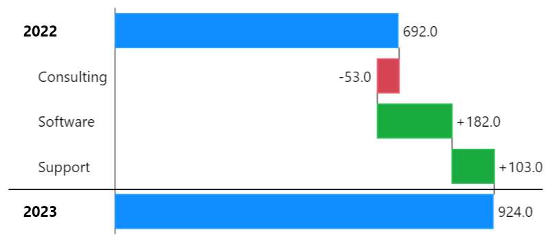
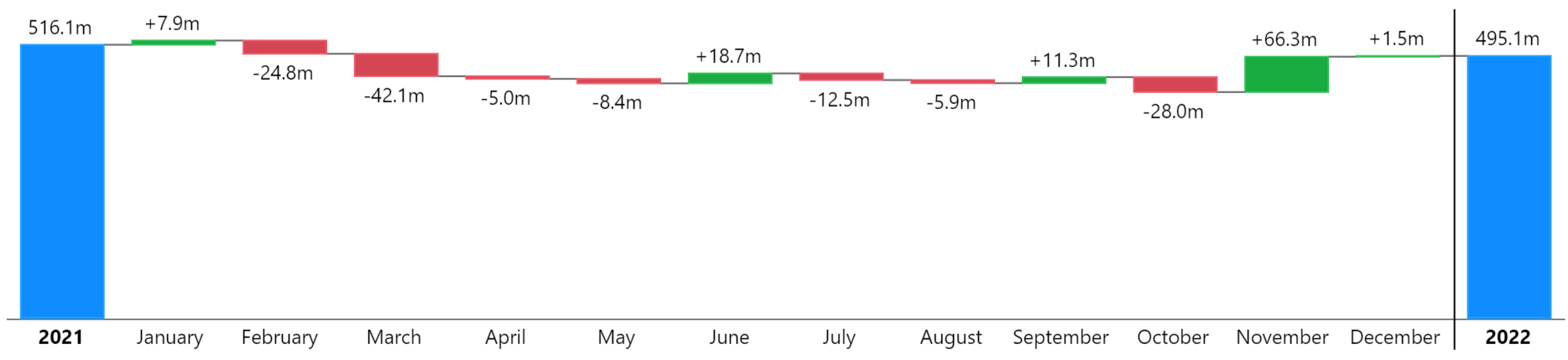
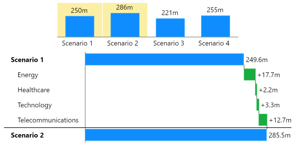
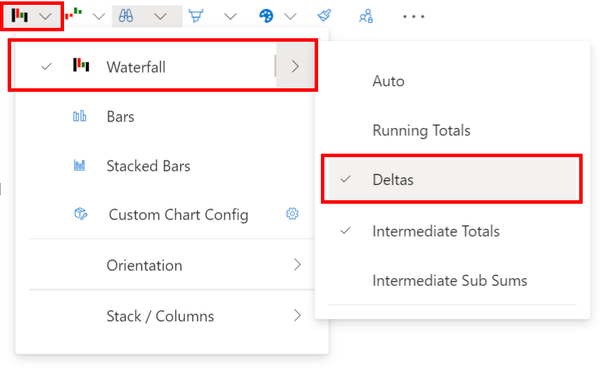
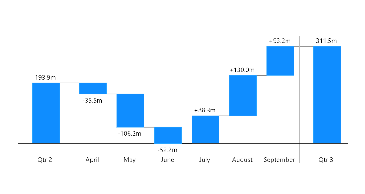 {% endhint %}
Additionally, it's worth noting that the first drill down into a forced delta chart drills down two levels. This happens because the start and end values are selected, and the selected element is compared over their children, resulting in a chart like this:
{% endhint %}
Additionally, it's worth noting that the first drill down into a forced delta chart drills down two levels. This happens because the start and end values are selected, and the selected element is compared over their children, resulting in a chart like this: